
Experimental
Add a toggle button to the Firefox user interface. With this module you can create buttons that function like a check box, representing an on/off choice.
Toggle buttons have all the same features as action buttons: they can display icons and respond to click events. Like action buttons, you can control their state on a per-window or per-tab basis as well as globally. Toggle buttons have two extra features:
- they emit a
changeevent when clicked, as well as aclickevent. - they have an extra attribute
checkedthat is automatically toggled when the button is clicked. When a button is checked it gets a "pressed" look in the user interface (note that the "Pressed" look currently does not work in Mac OS X).
Usage
Creating buttons
To create a button you must give it an ID, an icon, and a label:
var { ToggleButton } = require("sdk/ui/button/toggle");
var button = ToggleButton({
id: "my-button",
label: "my button",
icon: {
"16": "./firefox-16.png",
"32": "./firefox-32.png"
},
onChange: function(state) {
console.log(state.label + " checked state: " + state.checked);
}
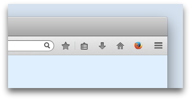
});By default, the button appears in the Firefox toolbar:
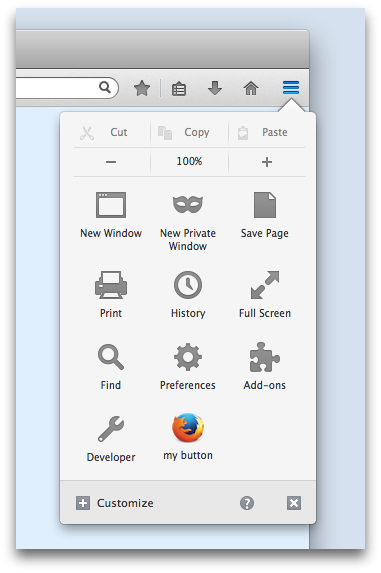
 However, users can move it to the Firefox menu panel:
Badged buttons
New in Firefox 36.
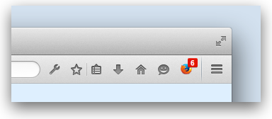
You can add a "badge" to a button using its badge property. This can contain a number or a string, and you can update it at any time. By default the badge's color is red, but you can set your own color using the badgeColor property, specified as a CSS <color> value:
var { ToggleButton } = require("sdk/ui/button/toggle");

var button = ToggleButton({
    id: "my-button1",
    label: "my button1",
    icon: "./icon-16.png",
    onChange: changed,
    badge: 0,
    badgeColor: "#00AAAA"
  });

function changed(state) {
  button.badge = state.badge + 1;
  if (state.checked) {
    button.badgeColor = "#AA00AA";
  }
  else {
    button.badgeColor = "#00AAAA";
  }
}
Specifying multiple icons
You can specify just one icon, or multiple icons in different sizes.
If you specify multiple icons, Firefox will select the best-fitting icon based on the device screen resolution and the place the icon appears. For example, in the screenshots above, Firefox uses the small icon when the button is in the toolbar and the large icon when the button is in the menu panel. Read more about specifying icons in the reference documentation for the ToggleButton constructor.
Responding to click events
You can respond to click events by assigning a listener to the button's click or change events. You can do this in the button's constructor, by assigning the listener to the onClick or onChange option. You can also add, or change, the listener afterwards:
var { ToggleButton } = require("sdk/ui/button/toggle");

var button = ToggleButton({
    id: "my-button",
    label: "my button",
    icon: {
      "16": "./firefox-16.png",
      "32": "./firefox-32.png"
    },
    onClick: firstClick,
    onChange: firstChange
  });

function firstClick(state) {
  console.log("You clicked '" + state.label + "'");
  button.removeListener("click", firstClick);
  button.on("click", subsequentClicks);
}

function subsequentClicks(state) {
  console.log("You clicked '" +  state.label + "' again");
}

function firstChange(state) {
  console.log("You changed '" + state.label + "'");
  button.removeListener("change", firstChange);
  button.on("change", subsequentChanges);
}

function subsequentChanges(state) {
  console.log("You changed '" +  state.label + "' again");
}
The listener is passed a state object that contains all the button's properties.
You can generate click and change events programmatically with the button's click() method.
Attaching panels to buttons
You can attach panels to buttons by passing the button as the position option to the panel's show() method or the panel's constructor:
var { ToggleButton } = require('sdk/ui/button/toggle');
var panels = require("sdk/panel");
var self = require("sdk/self");

var button = ToggleButton({
  id: "my-button",
  label: "my button",
  icon: {
    "16": "./icon-16.png",
    "32": "./icon-32.png",
    "64": "./icon-64.png"
  },
  onChange: handleChange
});

var panel = panels.Panel({
  contentURL: self.data.url("panel.html"),
  onHide: handleHide
});

function handleChange(state) {
  if (state.checked) {
    panel.show({
      position: button
    });
  }
}

function handleHide() {
  button.state('window', {checked: false});
}
Disabling buttons
You can disable a button by setting its disabled property to true. A disabled button will not generate click or change events and its icon will appear disabled:

Updating state
You can update all the button's properties, except for its id.
Depending on your application, you might want a button to have different state in different browser windows or different tabs. For example, you might want to give it a different appearance when the current page is being served over HTTPS. The button API handles this by defining a tree of potential states. At the root is the global state, then there's a state you can set for each window, then a state you can set for each tab.
More-specific states override less-specific states. For example, suppose the browser has two windows (W1 and W2), and each window has two tabs. Initially the buttons in all tabs and windows will display the label value inherited from the global state:
- Browser: label = "my default"
- W1
- T1 > displays "my default"
- T2 > displays "my default"
- W2
- T3 > displays "my default"
- T4 > displays "my default"
- W1
If you then set a label specific to T3 as "my T3 label", then set a label state specific to W2 as "my W2 label", then the button displayed when T3 is the active tab will still show "my T3 label", but the button displayed when T4 is the active tab will show "my W2 label":
- Browser: label = "my default"
- W1
- T1 > displays "my default"
- T2 > displays "my default"
- W2
- T3 > displays "my T3 label"
- T4 > displays "my W2 label"
- W1
Setting the properties on the button instance sets the button's global state:
button.label = "my new label";You can set state to be specific to a window or tab using the button's state() method. To set state like this, call state() with 2 parameters:
- the first parameter is a
windowortabobject or as a shorthand, the string "window" for the currently active window, or the string "tab" for the currently active tab - the second parameter is an object containing the state properties you wish to update.
Here's an add-on with a button that disables itself when you click it, but only for the currently active window:
var { ToggleButton } = require("sdk/ui/button/toggle");

var button = ToggleButton({
    id: "my-button",
    label: "my button",
    icon: {
      "16": "./firefox-16.png",
      "32": "./firefox-32.png"
    },
    onClick: disableForThisWindow
  });

function disableForThisWindow(state) {
  button.state("window", {
    disabled: true
  });
}
To fetch the state for a specific window or tab, call state(), passing in the window or tab you are interested in, and it will return the state:
var labelForActiveTab = button.state("tab").label;To learn more about this, see the API documentation for state().
Updating checked
You can update a toggle button's checked property in just the same way you update its other properties, but there's one extra thing you need to keep in mind.
The checked property is not only updated directly by assignment, but is also updated when the user clicks the button (or when some code calls button.click()). When that happens, the button is updated for the window whose button was clicked. Because window-specific state overrides global state, if you try to update checked by direct assignment to the button, this will be overridden by the user clicking the button.
If you want to change this default behavior, you can delete the window-specific state in your button's onChange handler. For example, here's a button that makes click events update checked globally, and not just for the current window:
var { ToggleButton } = require('sdk/ui/button/toggle');

var globalToggle = ToggleButton({
  id: 'my-global-toggle',
  label: 'global',
  icon: './foo.png',
  onChange: function() {
    // delete the window state for the current window,
    // automatically set when the user click on the button
    this.state('window', null);

    // now that the state hierarchy is clean, set the global state
    this.checked = !this.checked;
  }
});
Here's a button that makes click events update only the current tab:
var { ToggleButton } = require('sdk/ui/button/toggle');

var tabToggle = ToggleButton({
  id: 'my-tab-toggle',
  label: 'tab-specific',
  icon: './foo.png',
  onChange: function() {
    // delete the window state for the current window,
    // automatically set when the user click on the button
    this.state('window', null);

    // now that the state hierarchy is clean, set the
    // tab state for the current tab
    let { checked } = this.state('tab');
    this.state('tab', {checked: !checked});
  }
});
Destroying buttons
When you've finished with a button, destroy it by calling its destroy() method. After that, any attempts to access any of its properties or to call any of its methods will throw exceptions.
Globals
Constructors
ToggleButton(options)
Creates a toggle button.
Parameters
options : object
Required options:
| Name | Type | |
|---|---|---|
| id | string |
The button's ID. This is used internally to keep track of this button. The ID must be unique within your add-on. |
| label | string |
The button's human-readable label. When the button is in the toolbar, this appears in a tooltip, and when the button is in the menu, it appears underneath the button as a legend. |
| icon | url, string, object |
One or more icons for the button. You can specify this in one of three ways:
If you use the final form, Firefox will automatically choose the best-fit icon for your button, depending on the device screen resolution and where the button is in the UI. On a device with a "normal" screen resolution, the toolbar has space for 18 x 18 pixels and the menu panel has space for 32 x 32 pixels. On a high resolution screen (such as a HiDPI display), these are doubled to 36 x 36 and 64 x 64 pixels, respectively. So you can supply three icon files: This will look fine in both toolbar and menu panel, and for both screen resolutions. However, the icons in the toolbar will not quite fill the space available, so you can instead supply four icons: |
Optional options:
| Name | Type | |
|---|---|---|
| disabled | boolean |
Determines whether the button is disabled. Disabled buttons appear disabled in the UI, and do not respond to clicks. Defaults to false. |
| onChange | function |
Change handler for the button. |
| onClick | function |
Click handler for the button. |
| badge | Number or String |
New in Firefox 36. Badge to attach to the button. The badge can contain as many characters (or digits) as you like, but only the first four will be displayed. |
| badgeColor | CSS <color> value |
New in Firefox 36. Color for the badge. If |
ToggleButton
Methods
click()
Click the button. This will cause the button to generate the click event:
var { ToggleButton } = require('sdk/ui/button/toggle');

var button = ToggleButton({
  id: "my-button",
  label: "my button",
  icon: {
    "16": "./firefox-16.png",
    "32": "./firefox-32.png"
  },
  onClick: function(state) {
      console.log("You clicked '" + state.label + "'");
  }
});

button.click();
state()
Get or set the button's state for a specific window or tab.
By default, a button's properties are global, meaning that they are the same across all open windows and tabs, and that if you update these properties, then they are updated across all windows and tabs. But sometimes you want a button attached to one window (or tab) to have a different state to a button attached to a different window (or tab). That's what state() is for.
To set a button's properties for a specific window or tab, call state(), passing it the window or tab you want the property to apply to, and the property value to set. A special shortcut allows you to pass the string "window" or "tab" to select the currently active window or tab.
For example, if you have a button like this:
var { ToggleButton } = require('sdk/ui/button/toggle');

var button = ToggleButton({
  id: "my-button",
  label: "default",
  icon: "./firefox-16.png"
});
You can change its label for only the currently active window like this:
button.state("window", {
  "label" : "window-specific label"
});
You can change its label for only the currently active tab like this:
button.state("tab", {
  "label" : "tab-specific label"
});
To fetch the button state for a specific window or tab, call state(), passing it the window or tab you're interested in, and it will return a state object containing the id, label, icon, and disabled properties for the button associated with that window or tab. Again. you can use the strings "window" or "tab" as shortcuts. For example, this add-on:
- creates a button with a default label
- opens a new tab
- sets a new label only for the new tab
- logs the result of accessing the global label, the window-specific label, and each of the 2 tab-specific labels
var { ToggleButton } = require('sdk/ui/button/toggle');
var tabs = require("sdk/tabs");

var button = ToggleButton({
  id: "my-button",
  label: "default label",
  icon: "./firefox-16.png"
});

tabs.open({
  url: "https://mozilla.org/",
  onOpen: onNewTab
});

function onNewTab(tab) {
  // Modify the label only for the new tab
  button.state(tab, {
    "label" : "tab-specific label"
  });

  // access the global label -> "default label"
  console.log(button.label);

  // access the window's label -> "default label"
  console.log(button.state("window").label);

  // access the first tab's label -> "default label"
  console.log(button.state(tabs[0]).label);

  // access the second tab's label -> "tab-specific label"
  console.log(button.state(tabs[1]).label);
}
Setting a property won't affect a more-specific property setting. For example, if you have a window with two tabs, and you set a tab-specific label, then set the window-specific label, this will not overwrite the tab-specific label:
var { ToggleButton } = require('sdk/ui/button/toggle');
var tabs = require("sdk/tabs");

var button = ToggleButton({
  id: "my-button",
  label: "default label",
  icon: "./firefox-16.png"
});

tabs.open({
  url: "https://mozilla.org/",
  onOpen: onNewTab
});

function onNewTab(tab) {
  // Modify the label only for the new tab
  button.state(tab, {
    "label" : "tab-specific label"
  });

  // Modify the label for the window
  button.state("window", {
    "label" : "window-specific label"
  });

  // access the global label -> "default label"
  console.log(button.label);

  // access the window's label -> "window-specific label"
  console.log(button.state("window").label);

  // access the first tab's label -> "window-specific label"
  console.log(button.state(tabs[0]).label);

  // access the second tab's label -> "tab-specific label"
  console.log(button.state(tabs[1]).label);
}
The best way to think of this is as a tree: the global state is the root, followed by the state for each window, followed by the state for each tab in a window. If a property value for a node in the tree has not been set explicitly using state(), then it inherits its value from the next level up. So if you have one window containing two tabs, and have set the button's label only for tab A, then tab B will inherit label's value from the window, and changing the value for the window will implicitly change the value for tab B.
To delete a tab- or window-specific state, assign null to the property. After that, the property will inherit its value from the less-specific state as before:
var { ToggleButton } = require('sdk/ui/button/toggle');
var tabs = require("sdk/tabs");

var button = ToggleButton({
  id: "my-button",
  label: "default label",
  icon: "./firefox-16.png"
});

tabs.open({
  url: "https://mozilla.org/",
  onOpen: onNewTab
});

function onNewTab(tab) {
  // Modify the label only for the new tab
  button.state(tab, {
    "label" : "tab-specific label"
  });

  // Modify the label for the window
  button.state("window", {
    "label" : "window-specific label"
  });

  // access the global label -> "default label"
  console.log(button.label);

  // access the window's label -> "window-specific label"
  console.log(button.state("window").label);

  // access the first tab's label -> "window-specific label"
  console.log(button.state(tabs[0]).label);

  // access the second tab's label -> "tab-specific label"
  console.log(button.state(tabs[1]).label);

  // Reset the tab-specific state
  button.state(tab, null);

  // access the second tab's label -> "window-specific label"
  console.log(button.state(tabs[1]).label);
}
Finally, you can pass the button itself into state(). This is an alternative way to set or get the global state. The reason for using this, rather than setting state properties individually, is that you can define an object with the properties to set in one place, then apply it to the global state with a single line:
const defaultState = {
  "label": "default label",
  "icon": "./default.png",
}

const differentState = {
  "label": "different label",
  "icon": "./different.png",
}

var { ToggleButton } = require("sdk/ui/button/toggle");

var button = ToggleButton({
    id: "default-label",
    label: "default label",
    icon: "./default.png",
    onClick: function(state) {
      if (button.label == "default label") {
        button.state(button, differentState);
      }
      else {
        button.state(button, defaultState);
      }
      console.log(button.state(button).label);
      console.log(button.state(button).icon);
    }
  });
Parameters
target : button, tab, window, string
- To set or get the global state, this needs to be the
buttoninstance. - To get or set window-specific state, this needs to be the
windowobject for which you wish to set a specific state, or the string "window" to select the currently active window. - To get or set tab-specific state this needs to be the
tabobject for which you wish to set a specific state, or the string "tab" to select the currently active tab.
state : object, null
Include this parameter only if you are setting state. It is an object containing all the properties you wish to set. For example:
button.state("tab", {
  "label" : "tab-specific label",
  "icon": "./tab-specific-icon.ico"
});
To reset state, pass null:
button.state("tab", null);Returns
state : if you have passed the second state argument to make this function a setter, it returns undefined. Otherwise, it functions as a getter and returns the button's state for the specified object. This logs the state for the button associated with the currently active tab:
console.log(button.state("tab"));This object represents a snapshot of the state at the time state() is called. It is not kept up to date with changes made to the button:
button.label = "foo";
var state = button.state(button);
button.label = "bar";
console.log(state.label) // foo
on()
Add a listener to an event emitted by the button.
button.on("click", handleClick)

function handleClick(state) {
  console.log("button '" + state.label + "' was clicked");
}
Parameters
event : string
The event to listen for. Toggle buttons emit two types of event, "click" and "change".
listener : function
Function that will be called on the event.
once()
Assign a listener to the first occurrence only of an event emitted by the button. The listener is automatically removed after the first time the event is emitted.
Parameters
event : string
The event to listen for. Toggle buttons emit two types of event, "click" and "change".
listener : function
Function that will be called on the event.
removeListener()
Removes an event listener. For example, this code is equivalent to once():
button.on("click", handleClick)

function handleClick(state) {
  console.log("button '" + state.label + "' was clicked");
  button.removeListener("click", handleClick);
}
Parameters
event : string
The event to listener is listening for. Toggle buttons emit two types of event, "click" and "change".
listener : function
The listener to remove.
destroy()
Destroy the button. After calling this function, the button will no longer appear in the UI, and accessing any of its properties or methods will throw an error.
Properties
id
The button's unique ID. This property is read-only.
label
The button's label.
icon
The button's icon or icons, as a URL, relative path, or object containing a set of key-value pairs.
disabled
Boolean property indicating whether or not the button is disabled.
checked
Boolean property indicating whether or not the button is checked. It's initialized to false, or the value of the checked option to the button's constructor. It is then flipped, on a per-window basis, whenever the user clicks the button or when the button's click() method is called.
badge
New in Firefox 36.
Value to attach to the button as a badge. May be a number or a string.
The badge can contain as many characters (or digits) as you like, but only the first four will be displayed.
badgeColor
New in Firefox 36.
Color for the badge, specified as a CSS <color> value.
Events
click
This event is emitted when a user clicks the button or your add-on calls the button's click() method.
Arguments
state : The button's state. This includes all the button's properties.
change
This event is emitted when a user clicks the button or your add-on calls the button's click() method. This event is emitted at the same time as click and its listener receives the same argument. The only purpose of the extra event is that change is a more natural event name for a toggle button, as it matches the change event emitted by elements like <select> and <input>.
Arguments
state : The button's state. This includes all the button's properties.