
Features of the menuitem Element
The menuitem element has a number of features beyond just being a label for a menu command.
Adding shortcut keys to menu items
A shortcut key may be associated with a menu item. Unlike the access key, which only functions while the menu is open, a shortcut key works at any time. A shortcut key can be created using the key element. In reality, the keyboard shortcut is handled by the key element, however, the menu item will display the shortcut next to its label. This allows the user to discover what shortcut keys are available by looking at the menus.
<keyset>
  <key id="open-key" modifiers="accel" key="O"/>
  <key id="close-key" modifiers="accel" key="C"/>
</keyset>
<menubar>
  <menu label="View">
    <menupopup>
      <menuitem label="Open" key="open-key"/>
      <menuitem label="Close" key="close-key"/>
    </menupopup>
  </menu>
</menubar>
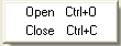
The two menuitems are associated with a key using the key attribute. It should be set to the ID of a key element within the same document. The result is that the items will display the shortcut key next to their labels. For the "Open" item in this example, this command can be invoked by using the "accel" modifier key and pressing 'O'. The "accel" modifier key varies on each platform, but is the key typically used for shortcut keys. For instance, if the "accel" key is Control, the menu might display "Ctrl + O".
Although there isn't usually a need to do so, you can also set a custom label for the keyboard shortcut on the menu using the acceltext attribute. You might do this if the key associated with the item changes, for instance a list of open windows displayed on a Window menu.
<menuitem label="First Window" acceltext="1"/>
Here the keyboard shortcut label will be '1', however you will need to write code to handle the key as well.
Adding icons to menu items
An icon may be added to a menu item using the image attribute. The icon will appear to the left of the menuitem label. In addition to the image, a special class "menuitem-iconic" must be used on the menuitem to indicate that an icon is expected.
<menuitem id="add-bookmark" class="menuitem-iconic" label="Add Bookmark" image="addbookmark.png"/>
As the image appears on a menu item, you will want to ensure you use a fairly small image. Although the exact size will vary depending on the theme being used, the size of menu item images should generally be around 16 by 16 pixels. Instead of specifying the icon with the image attribute, you can also reference the image in a style sheet with the 'list-style-image' property.
#add-bookmark {
  list-style-image: url('addbookmark.png');
}
This technique can also be used to apply an image for the menu element, except you would want to use the "menu-iconic:" class instead.
<menuitem id="bookmark" class="menu-iconic" label="Bookmarks" image="bookmarks.png"/>
Menu icon animation
In order to animate the menu item icon on hover a -moz-image-region rule can be applied. In this example we use an image that is 16px wide and 32px high. the top 16px square is the icon in normal state the bottom part in hovered state.
Note that the image element is on a child level underneath the menu or menuitem, and it will have the class menu-iconic-icon. Hence, -moz-image-region is not applied to the menu itself, but one level lower:
<menuitem id="add-bookmark" class="menuitem-iconic" label="Add Bookmark" image="addbookmark.png"/>

#add-bookmark {  list-style-image: url('addbookmark.png'); }

#add-bookmark .menu-iconic-icon { -moz-image-region: rect(0px, 16px, 16px, 0px) !important; }

#add-bookmark:hover .menu-iconic-icon { -moz-image-region: rect(16px, 16px, 32px, 0px)  !important; }
This behavior is fundamentally different to other HTML elements, such as <li> or <div> where list-style-image and -moz-image-region can be applied at the same element level.
Checkbox menu items
Sometimes, you will want to have an item on a menu that acts as a toggle. For instance, a menuitem that can be used to toggle a toolbar on and off. To indicate the current state of the toolbar, a checkbox would be displayed next to the menu item label. If the checkbox is on, the toolbar is shown, whereas if the checkbox is off, the toolbar is not shown. The user can select the menu item to switch the toolbar visibility.
This type of menuitem can be created by using the type attribute and setting it to the value "checkbox".
<menu label="View" accesskey="V">
  <menupopup>
    <menuitem label="Show Toolbar" accesskey="T" type="checkbox" checked="true"/>
    <menuitem label="Show Status Bar" accesskey="S" type="checkbox"/>
  </menupopup>
</menu>
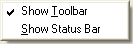
Both menuitems are of the checkbox type. The first menuitem is checked by default, as indicated by the checked attribute set to the value true. The second menuitem is not checked by default. When the user activates the menuitem, the command event gets fired. From within a command listener, you can execute code which will change the state of the toolbar or status bar or whatever it is that need changing. You do not need to update the checked attribute as the menuitem will update this automatically before the command event is fired.
Note that the checked state is updated before the command event fires, so if you use the menuitem's checked attribute within the command listener, it will already be in the new state.
<script>
function changeToolbarState(event)
{
  if (event.target.getAttribute("checked") == "true")
    showToolbar();
  else
    hideToolbar();
}
</script>
...
<menuitem label="Show Toolbar" accesskey="T" type="checkbox"
          oncommand="changeToolbarState();"/>
In this example, we show the toolbar when the menuitem is checked and hide the toolbar otherwise.
There may be times when you do not want the checkbox state to be updated automatically when the menuitem is activated. This can be useful if there's a possibility that whatever action is carried out could fail. One possibility is to simply reverse the checkbox state again. As this can be more complicated, it is also possible to use the autocheck attribute to disable this behavior. When the autocheck attribute is set to false, the checkbox state is not updated automatically, and you must write code to adjust the state yourself.
<script>
function changeToolbarState(event)
{
  if (event.target.getAttribute("checked") == "true")
    hideToolbar();
    event.target.removeAttribute("checked");
  }
  else {
    if (!showToolbar())
      return;
    event.target.setAttribute("checked", "true");
  }
}
</script>
...
<menuitem label="Show Toolbar" accesskey="T" type="checkbox" autocheck="false"
          oncommand="changeToolbarState();"/>
This version of the changeToolbarState function changes the checked attribute itself. The autocheck attribute has been set to false on the menuitem so the checked attribute will not be updated automatically. Note that the code has been reversed in the condition blocks to hide the toolbar when the menuitem is checked and show the toolbar when the menuitem is not checked because the checked state hasn't been modified. The example assumes that the showToolbar() function might fail so if it returns false, the checked attribute is not modified.
When clearing the checked state, the checked attribute should be removed rather than just set to false. In the example, this is done by using the removeAttribute method.
Radio menu items
A radio menu item os used when you wish to have a group of menuitems in which only one can be checked at a time. This works similarly to the checkbox type, except when selecting an item, all others in the same group are automatically unchecked.
To create a menuitem that acts like a radio button, set the type attribute to "radio". In addition, set the name attribute to the name of the group that it belongs to. The value of this attribute can be any name you wish; all radio menuitems within the same menu with the same name are part of the same group.
<menu label="Sort" accesskey="S">
  <menupopup>
    <menuitem label="By Name" accesskey="N" type="radio" name="sort"/>
    <menuitem label="By Date" accesskey="D" type="radio" name="sort" checked="true"/>
    <menuitem label="By Subject" accesskey="S" type="radio" name="sort"/>
    <menuseparator/>
    <menuitem label="Ascending" accesskey="A" type="radio" name="order" checked="true"/>
    <menuitem label="Descending" accesskey="c" type="radio" name="order"/>
  </menupopup>
</menu>
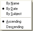
This menu has three radio type menuitems all with the same name "sort". That means that activating one of the items will check that item and uncheck all other items. The last two menuitems are in a different group "order". Activating one will uncheck the other, but will not affect the items in the other group.
Note how the checked attribute is set to true on one of the radios in each group. This becomes the default value for the menu. If you do not set one, none of the items in that group will be checked by default.
As with checkbox type menuitems, you can also set the autocheck attribute on a radio menuitem to disable the automatic adjustment of the checked state. This needs to be set on each radio menuitem.
Disabling a menuitem
To have an item initially disabled, set the disabled attribute to true as in the following example:
<menuitem label="Undo" accesskey="U" disabled="true"/>
When disabled, the item will appear greyed out and the action associated with the item cannot be carried out. The command event will not fire when an item is disabled. To disable a menuitem that doesn't apply, set the disabled property to true. To renable the item again, set the disabled property to false again. You may wish to change the disabled state in a popupshowing event handler. For more information about the popupshowing event, see The popupshowing event.
If a menuitem is associated with a command, you can disable the menuitem by disabling the command instead. For instance, in the sample below, the Delete command is disabled using the disabled attribute.
<command id="cmd_delete" disabled="true" oncommand="alert('Deleted!');"/>
<menuitem label="Delete" accesskey="F" command="cmd_deleted"/>
As the menuitem is attached to the command, it's automatically disabled when the command is disabled. If the disabled state of the command is changed, the menuitem updates accordingly. This is an advantage when attaching several menuitems or buttons to the same command, as the disabled state can be adjusted once for the command, and this will propagate to all elements attached to it.
Modifying a menuitem
Both the label and the access key may be changed dynamically in script by setting the label and accesskey properties. Note the mixed case of the accessKey property versus the lowercase usage of the accesskey attribute in XUL.
For instance, you might want to change the label of an Undo menuitem based on what would be undone. The example below demonstrates this.
if (gUndoBufferType == "typing")
  menuitem.label = "Undo Typing";
else if (gUndoBufferType == "paste")
  menuitem.label = "Undo Paste";
else
  menuitem.label = "Undo";
See Modifying a Menu for examples of how to add and remove items from a menu