
Menus
A menu provides a list of commands that the user can carry out.
Menu Types
A menu is created using the menupopup tag. It is normally attached to a menubar or to a button. When the menu or button is clicked the menu is opened, listing the commands that are available. The user may select a command to invoke it, or may cancel the operation by pressing Escape or clicking outside the menu.
XUL provides a number of tags for creating menus. These tags can be used to create menus which sit on a menubar or are attached to buttons. Submenus may be created by nesting one menu inside of another. No special code needs to be written to open or close a menu or submenu, and, in addition, the menus are placed on screen in the appropriate locations automatically.
There are four elements that a menupopup can be attached to. In each case, the menupopup element is placed as a direct child of the element. The following is a brief summary of these elements, examples of each will be provided later.
- menu
- The menu tag is used when placing menus on a menu bar. For example, the File and Edit menus along the top of an application window (or the menubar on the top of screen). This type of menu is usually used for commands that apply to the entire application. Commands that don't apply at a given time should be disabled. However, the actual top level menus do not generally change for a given window.
- button
- A menu may be attached to a button by setting the
typeattribute of the button to 'menu'. Instead of creating a standard button, this will create a button with a small arrow or other indicator. Clicking the button will display the menu, allowing a command to be selected. This type of menu would be used when you want to have a set of commands yet don't want to use a menu bar, for example in a dialog box. See Menu Buttons for more information. - toolbarbutton
- Toolbar buttons can also support menus. This works just like it does for other buttons. See Menu Buttons for more information.
- menulist
- A menulist is used when you wish the user to select from a list of items. For this type of menu, one of the items within it is selected. When another item is selected, the label of the item is set as the label of the menulist. Other user interfaces call this type of widget a combobox.
You may also see a popup tag used in place of the menupopup tag. The popup tag is deprecated but is equivalent to the menupopup tag.
Menu Tag Overview
The following shows a simple menu example, containing a menubar with a single menu labeled 'File'.
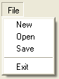
<menubar id="sample-menubar">
  <menu id="file-menu" label="File">
    <menupopup id="file-popup">
      <menuitem label="New"/>
      <menuitem label="Open"/>
      <menuitem label="Save"/>
      <menuseparator/>
      <menuitem label="Exit"/>
    </menupopup>
  </menu>
</menubar>
There are five tags used in this example, described briefly here:
- menubar
- A row of menus that appears along the top of the window or screen. It should contain menu elements.
- menu
- A label of a menu on a menubar, for instance 'File' or 'Tools'. A menu can also be used as the label of a submenu.
- menupopup
- A popup containing items to appear on a menu. The menupopup in the example above is a child of the 'File' menu and will appear when the menu label is clicked.
- menuitem
- A single item to appear on a menu. When the user moves the mouse over a menuitem, it will highlight the item. The cursor keys can also be used to adjust which menuitem is the current item. A menuitem is associated with a command to carry out.
- menuseparator
- A separator between items in a menu.
In the example above, the 'File' menu has four menuitems and one menuseparator on it. The menu and each menuitem has a label indicating its purpose.
Other types of tags should not appear on a menupopup. If you want to create a general purpose popup that isn't a menu, use a panel instead. For this, see Panels.
The menubar element
A menu bar is created by using the XUL menubar tag. Usually, the main window for an application will have a menubar across the top of the window. On the Macintosh, the menubar is placed along the top of the screen. You do not have to do anything to handle this difference. The first menubar encountered when parsing the XUL window will be used as the main menu bar for the window, and on the Macintosh, will be hidden from the main window and transformed into a native menu bar at the top of the screen. For this reason, a window should only have one menu bar, however, each window can have a different menu bar.
The menubar should have menu elements within it, one for each menu. The example below shows a menubar with three menus.
<menubar id="sample-menubar">
  <menu id="file-menu" label="File">
    ...
  </menu>
  <menu id="tools-menu" label="Tools">
    ...
  </menu>
  <menu id="help-menu" label="Help">
    ...
  </menu>
</menubar>
It's possible to place other elements on a menubar, but remember that they will not appear on a Macintosh. So you should ensure that the functionality of these elements is avialable elsewhere. Or, you could write code that handles multiple platforms in different ways. If you do place other elements on a menubar, you may wish to align them on the far side rather than next to the other menus. You can do this by adding a flexible spacer.
<menubar id="sample-menubar">
  <menu id="file-menu" label="File">
    ...
  </menu>
  <spacer flex="1"/>
  <image src="logo.png"/>
</menubar>
In this example, a logo image is placed on the end of a menubar.
The menupopup element
The menupopup element is the popup that displays the menu items. When used for menus on a menubar, the menupopup should be a child of the menu element. The following shows a simple Help menu.
<menu label="Help">
  <menupopup>
    <menuitem label="Contents"/>
    <menuitem label="Search Help"/>
  </menupopup>
</menu>
Normally, a menupopup is hidden. When the 'Help' label is pressed, the menupopup is displayed over top of the window, aligned along the bottom of the Help menu label. When a menu command is selected or the menu is cancelled, the menupopup disappears from the screen again.
The menu element
The menu element is used for the labels on a menubar and for the labels of submenus. For information about submenus, see Submenus below.
The label for the menu element is specified using the label attribute. In the example below, the menu has the label 'View'.
<menu label="View">
  <menupopup>
    <menuitem label="Toolbar"/>
    <menuitem label="Status Bar"/>
  </menupopup>
</menu>
When the menu is clicked, it opens the menupopup contained within it. For this reason, a menupopup should be placed as a direct child of the menu.
The menu can also be opened by using the keyboard. The user can press a key to highlight the menu labels and navigate with the cursor keys. The key is different for each platform; on Windows F10 can be used. Another way is to add shortcut keys called access keys for each menu element to make it easier to access the menu commands. On some platforms, adding an access key will underline a letter in the menu label indicating the key to press. For this reason, the access key should always correspond to a character that appears in the menu label.
To set an access key for a menu, use the accesskey attribute, as in the example below.
<menu label="File" accesskey="F"/>
This menu can then be opened by pressing the access key (typically in combination with the Alt key).
Naturally, the access keys should be unique on a menubar. So if you wanted to have a menu with the label Find, you would need to set a different access key.
<menubar>
  <menu label="File" accesskey="F"/>
  <menu label="Find" accesskey="d"/>
</menubar>
Here, the 'File' menu has the 'F' access key, and the 'Find' menu has the 'd' access key. Although the access keys are not case sensitive, the underlined letter will always be the one with matching case if available. For instance, an access key of 'W' will match the first letter in a menu label of 'Window', but the access key of 'w' will match the last letter. It is good practise to always use the same case when setting access keys.
The menuitem element
The menuitem element is used for each item that appears on a menu popup. As with the menu element, the label and accesskey attributes may be used to set the label and an access key for the item.
<menuitem label="Open" accesskey="O"/>

The access key will only function while the menu it is contained within is open, so access keys only need to be unique within that menu.
When the item is clicked with the mouse or the access key is pressed while the menu is open, the command event is fired at the menuitem. This is the manner in which an action can be associated with the menuitem. For instance, the action associated with a Open menuitem might be to open a file picker to select a file to open. In this example, a command event listener is attached to the item using the oncommand attribute. Here, it just displays an alert message.
<menuitem label="Open" accesskey="O" oncommand="alert('Open a File!');"/>
Another way to associate an action with a menu item is to use a command element. The example below has the same effect as the previous example, however it uses a command element instead of listening to the command event directly.
<command id="cmd_open" oncommand="alert('Open a File!');"/>
...
<menuitem label="Open" accesskey="O" command="cmd_open"/>
The command attribute should be set to the id of a command element within the same document, in this case 'cmd_open'. The command event will be fired on the command element instead of the menuitem. This is useful when you wish to have several elements performing the same action, for example a menuitem on a menubar, a context menu, and a toolbar button, because you can place the code to execute only once on the command and hook each element up to the command.
Menuitems also support displaying shortcuts associated with the menuitem, as well as icons beside the label. For details about adding shortcut keys to menus, see Adding Shortcut Keys to Menu Items. For details about adding icons to menus, see Adding Icons to Menu Items.
For details about creating checkbox menu items or radio menu items see Checkbox Menu Items or Radio Menu Items.
Menu items can be disabled by setting the disabled attribute to true. For an example, see Disabling a Menuitem.
The menuseparator element
The menuseparator element may be used to create a separator between menus. It is a good idea to group related commands together on a menu and use separators between different groups. This ensures that the items on the menu are easier to distinguish. There are no special attributes that would be used on a separator.
<menuseparator/>
Submenus
Sometimes, you will want an item on a menu to have additional commands tucked away on a second menu that is opened only when the item is selected. A submenu is created by nesting a menu element inside another menupopup. When the mouse is moved over the submenu label, or the cursor keys move the current item to the submenu, that menu's popup appears. It will close when the mouse is moved away or the current item is changed.
<menubar id="sample-menubar">
  <menu id="view-menu" label="View">
    <menupopup>
      <menuitem label="Toolbar"/>
      <menuitem label="Status Bar"/>
      <menuseparator/>
      <menu label="Sort" accesskey="S">
        <menupopup>
          <menuitem label="By Name"/>
          <menuitem label="By Date"/>
        </menupopup>
      </menu>
    </menupopup>
  </menu>
</menubar>
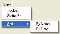
In this example, a top level 'View' menu has two child menuitems, a separator and a submenu created with the menu tag. The menu has the label 'Sort' and an access key of 'S'. This menu has a child menupopup with two items. The syntax for this menupopup is the same as the outer menupopup.
You could further add a third level of menus by using another menu element as one of the items inside the 'Sort' menupopup. However, this tends to become more difficult for the user to use, so you should avoid adding too many levels of submenus.
Sharing Menus Between Windows
If you wish to have several windows that share the same menu bar, a common technique is to place the menubar in an overlay and apply it to all of the windows. This allows the menu bar to be shared between each window without having to duplicate code. This technique may be used for individual menus or for an entire menu bar. For example, to have a Tools menu that is shared between all windows, just create a menu in the overlay, and include it in each window with a single line:
<menu id="menu-tools"/>
The overlay should have a menu with the same id 'menu-tools' containing the complete definition of the menu.
If you wish to have slight differences between each window, one possibility is to show or hide menu items in a load event listener. For example, to have an item initially hidden in a window:
function initMenus()
{
  var item = document.getElementById("menu-file-open");
  item.hidden = true;
}
The hidden property is set to true to hide the menu with the id 'menu-fileOpen'. This function may be called from within an onload attribute on the window.
Accessing and Setting the Active Item
In a menu, there will usually be an item that is considered "active". This item will be highlighted, and will do certain functions depending on the kind of item it is, and the way in which it has been activated, whether via the keyboard or mouse. For example, if it is a menu element and has been activated via a mouseover, then the menu will open. If it has been activated via navigation with the up or down arrow on the keyboard, then pressing the return key or right arrow key will open the menu. If it were a menuitem, then pressing the return key would have launched the command associated with it.
There may be occasion to access or set this programatically with a script. If the menu has been created using a menulist, this is easily accomplished using the selectedItem or selectedIndex properties. However, it is not possible to use these properties for menus whose popup is the child of menu, button, or toolbarbutton. However, there is a way to access the active item using the nsIMenuBoxObject interface:
activeItem = xulMenu.boxObject.QueryInterface(Components.interfaces.nsIMenuBoxObject).activeChild;
where xulMenu is the menu, button, or toolbarbutton object.
You can set the active item thusly so:
xulMenu.boxObject.QueryInterface(Components.interfaces.nsIMenuBoxObject).activeChild = item;
When the active item is set this way, keyboard navigation will now continue from this point. Setting activeChild to null will deactivate all items, and keyboard navigation will start from the top of the menu.
It should be noted that setting the active item in this way will not affect the selected property or selected attribute of the previously and newly activated item. You must unset/set those explicity for each item affected, if you want them to be. For menulists, however, setting the selectedItem or selectedIndex properties on the menu will automatically take care of that for you.