
In this section, we will look at some additional features of buttons.
Adding an Image
You can add an image to a button by specifying a URL in the image
The button below will have both a labelimage
<button label="Help" image="happy.png"/>
Button with CSS image
Another way to specify the image is by using the CSS list-style-image style property on the button. This is designed to allow the 'skin' (in this case, the appearance of the image) to be changed without changing the XUL file. An example is shown below.
<button id="find-button"
  label="Find" style="list-style-image: url('happy.png')"/>
In this case, the image 'happy.png' is displayed on the button. The style
Positioning the Images
By default, the image on a button will appear to the left of the text label. There are two attributes that can be used to control this position.
The dirreverse, the image will be placed on the right side of the text. By using the value normal, or leaving the attribute out entirely, the image will be placed on the left side of the text.
The orienthorizontal which is used to place the image on the left or right. You can also use the value vertical to place the image above or below. In this case, the dir attribute controls the placement above or below. The same values are used, where normal means place the image above the text, and reverse means place the image below the text.
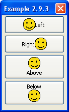
<button label="Left" image="happy.png"/>
<button label="Right" image="happy.png" dir="reverse"/>
<button label="Above" image="happy.png" orient="vertical"/>
<button label="Below" image="happy.png" orient="vertical" dir="reverse"/>
The example here shows all four types of alignment of buttons. Note that the two attributes are not specified when the default value can be used.
Buttons with Extra Content
Buttons may have arbitrary markup contained inside them, and it will be rendered inside the button. You probably wouldn't use this very often, but you might use it when creating custom elements.
For example, the following will create a button where two of the words are red:
<button>
  <description value="This is a"/>
  <description value="rather strange" style="color: red;"/>
  <description value="button"/>
</button>
Any XUL element may be placed inside the buttondescriptionlabel
Button with menupopup
You can place a menupopupmenulisttype attribute to the value menu.
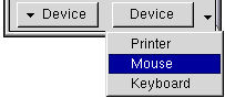
<button type="menu" label="Device">
  <menupopup>
    <menuitem label="Printer"/>
    <menuitem label="Mouse"/>
    <menuitem label="Keyboard"/>
  </menupopup>
</button>
In this example, the user may click the button to pop up a menu containing three items. Note that selecting one of these menu items does not change the label on the button, unlike a menulist
You can also set the type attribute to the value menu-button. This also creates a button with a menu, but the appearance will be different. The image to the right shows the difference. The left one is a 'menu' and the second one is a 'menu-button'. It has an arrow indicating the presence of a menu. For the 'menu', the user may click anywhere on the button to show the menu. For the 'menu-button', the user must click the arrow to show the menu.
Next, we will learn more details about how XUL elements are positioned in a window.