
Introduction
Welcome to the XUL Accessibility Guidelines. By following these principles and practices, you will be able to write your XUL applications in such a way that all users, including those with physical, sensory, or communicative disabilities, with be able to use and enjoy them. Accessibility is not difficult, but does require a basic understanding of the different types of disabilities, commonly used assistive technologies, and special accessibility features built into the XUL languages. Most of all, accessibility requires a conscious effort on your part, and a desire to include everyone.
It is hoped that these guidelines will be sufficiently clear and detailed that everyone—even someone with no previous background in accessibility—can understand them. In addition, there is an active community of accessibility developers within the Mozilla Project that will be happy to help you with any concerns or questions you have in regards to making your XUL applications fully accessible.
There is also a XUL accessibility tool which can help test some of these guidelines, but please be aware that no tool can replace human judgement for accessibility, and understanding the guidelines is vital.
| Accessibility | Platform Features | Mozilla Community |
|---|---|---|
| Software Accessibility - Where Are We Today? Intro to accessibility, assistive technologies, and Mozilla resources.
Introduction to Web Accessibility. Overview of web accessibility from WebAIM. Dive Into Accessibility. Downloadable book on web accessibility with tips and character sketches. Assistive technology compatibility. List of popular assistive technologies and their respective compatibility levels with XUL. #accessibility. Accessibility channel for general discussion around Internet accessibility with logger. Useful at conferences. |
Apple Accessibility. Portal to Apple accessibility.
LARS (Linux Accessibility Resource Site). Portal for general Linux accessibility. Microsoft Accessibility. Portal for Microsoft accessibility. |
Accessibility - MDC. Accessibility hub on the Mozilla Developer Center.
mozilla.support.accessibility. Mozilla accessibility newsgroup. #accessibility. Accessibility channel on Mozilla's IRC server. |
Guidelines
Keyboard access
Keyboard access is important to users who can't use a mouse. Many screen reader users and those with physical disabilities rely on the keyboard as their primary input tool. These users require easy, predictable, and well-documented keyboard control.
Tab order
Provide a logical tab order and ensure that users can navigate all content using a keyboard. By default, the tab order is determined by the order of the elements in the underlying code. It can also be set programmatically with the tabindex attribute if needed, but this should be done sparingly and thoroughly tested whenever it is used. The navigation order should be logical, generally left to right, top to bottom. Navigation order may vary depending on the nature of the application or the reading direction of the language.
Ensure that tab order is logical and all interactive elements can be accessed simply without the use of a mouse. You should be able to perform all functionality either directly in the application or through menu items or the context menu.
Trees
Provide alternative functionality for inaccessible operations. The column picker and column headers in XUL trees are not keyboard accessible, consistent with the standard tree behavior on most contemporary operating systems. It is therefore necessary to provide a keyboard accessible alternative for accessing this functionality.
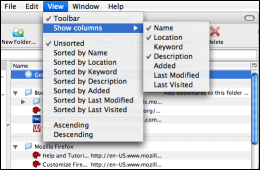
The Firefox "Bookmarks Manager" provides an example of how to make trees more accessible. The bookmark manager allows users to sort bookmarks by a particular column of information and choose which columns to display. Because column headers and the column picker, in the upper right hand corner of the tree, can not receive focus, they are not operable with a keyboard. In the bookmark manager this functionality is available under the view menu which is accessible to a keyboard user.
Toolbarbuttons
By default, toolbar buttons cannot receive focus with a keyboard. The recommended way of fixing this is that all functionality associated with a toolbar be duplicated elsewhere in the application, such as in a menu item or context menu. In cases where duplication of functionality is not possible (such as a window without a menu bar), toolbar buttons can be made focusable by adding the special CSS rule -moz-user-focus: normal. (Firefox's "Print Preview" window uses this fallback technique.) This should only be used as a last resort, and it should be consistent throughout a window (that is either all toolbar buttons are tabbable or none of them are).
Keyboard shortcuts
Keyboard shortcuts are very useful to users needing keyboard access. There are many ways to provide keyboard shortcuts. They are well documented in the XUL Tutorial:Keyboard Shortcuts.
Careful attention should be taken when setting keyboard shortcuts. When creating an extension (for Firefox or another XUL application), make sure the keyboard shortcuts you assign do not interfere with those already defined by the base application. Refer to the following resources when setting keyboard shortcuts.
| Keyboard Shortcuts and Accesskeys |
|---|
| Mozilla Keyboard Planning FAQ and Cross Reference. An excellent guide for determining unused key combinations and cross platform issues.
Mozilla Keyboard Shortcuts. A full list of keyboard shortcuts for the various Mozilla applications. Mozilla's accesskey FAQ. A short reference for using the accesskey attribute. |
Context menus
The context menu is the small menu activated with a right mouse click on a content area or element (or with Shift + F10 or VK_APPS on Windows and Ctrl + Click or Ctrl + Space on a Mac). Use the oncontextmenu event handler or the context attribute to create context menus. Do not specifically code them to open on a click of the right mouse button. The oncontextmenu event and context attribute work with the correct platform-specific context menu triggers, including the keyboard button and appropriate mouse clicks.
Mouse dependent scripting
Functionality associated with mouse events such as onmouseover, onmousemove, and ondrag can only be activated with the use of the mouse. Provide keyboard-accessible alternative access points for this functionality. Consider using context menu items or other XUL elements along with keyboard shortcuts.
Scrolling
Ensure that scrolling is keyboard accessible. Many XUL elements can be set to scroll using CSS. Other elements, such as arrowscrollbox and listbox, are made to scroll automatically. As a general rule, elements set to scroll are inaccessible if the user cannot scroll to all the content using the keyboard. The arrowscrollbox, for example, is a non-focusable element and cannot be scrolled using a keyboard. A listbox, however, can receive focus so its contents can scroll. Almost any XUL element can be set to scroll by setting a style to "overflow: auto" or "overflow: scroll". This flexibility should be used carefully.
Maintaining focus
The user should typically control where the current focus is located. Avoid changing the focus automatically. However, disabling, hiding, or destroying the focus element (or any ancestor of the focus element) can cause a loss of focus. To prevent this, move the focus to the next element before disabling, hiding, or destroying the focus element.
The following example shows a JavaScript function that can be called before destroying an element to check for focus and move it if necessary.
function moveFocus(element)
{
    if(element == document.commandDispatcher.focusedElement)
    {
        document.commandDispatcher.advanceFocus();
        return true;
    }

    return false;
}
Changing focus unexpectedly can confuse or disorient users. A common example of this occurrence in the US is with phone number form fields. US phone numbers are often displayed on the web in two main formats XXX-XXX-XXXX or (XXX) XXX-XXXX. To enforce this pattern some forms provide three form fields. The problem occurs when a developer decides to add functionality that jumps the user to the second form field once 3 digits have been entered into the first form field. This behavior is then repeated for the next form field. Users who are used to navigating form fields themselves often end up repeating the jump operation and thereby skipping ahead one form field.
Initial dialog focus
The initial focus in a XUL dialog (i.e., the focus when the dialog is first opened) should always be on a specific control, not on the dialog itself. In a tabbed dialog, focus should normally start on the first control in the selected tab. In all other dialogs, focus should just start on the first control (although it can be on any other control if there is a good reason for, just not on the dialog itself).
Testing keyboard access
To test keyboard accessibility, simply unplug or disable your mouse and attempt to use your application with only your keyboard. Verify that the tab order is logical. Make sure you have access to all functionality either directly or through alternative means such as menu items or context menus. Ensure that the user can read all content.
Assistive information
Users of assistive technologies often require additional markup to understand meanings and associations that may be intuitive to visual users. This additional markup is what is known as assistive information. Providing the additional information is easy, but is often forgotten because it yields little or no visual change.
Alternative text
Provide alternative text for meaningful images. Alternative text is not needed when an image serves a purely decorative function. Use the "alt" attribute to describe HTML images and use the "tooltiptext" attribute on XUL elements that use images (i.e. image elements, buttons with images). For toolbar buttons with images it is recommended to use both a text label in the label attribute and image alt text in the tooltiptext attribute. View the code examples below.
<image src="stop.png" tooltiptext="Stop" />

<html:img src="stop.jpg" alt="Stop" />
<html:img src="decorative_image.jpg" alt="" /> <!-- In HTML the alt attribute is required. -->

<toolbarbutton label="Stop" image="stop.png" tooltiptext="Stop loading the page" />
Title
Provide unique titles to window container elements such as windows, wizards, and dialogs. Titles provide users the most basic information about the application. The title is often the first thing spoken by a screen reader when an application is opened or activated. Users can also refer back to the title to get a sense of where they are located. Titles are displayed in the top bar of an application. View code examples below.
<dialog id="print_dialog" title="Print"                  ...>
<window id="mywindow"     title="My Application"         ...>
<wizard id="reg_window"   title="Register your software" ...>
Form labels
Labels are not automatically associated to form elements. Use the control attribute to bind a text label (from a label element) to a form element. Screen readers will then read aloud the label when entering a form field. For labels that may wrap to a second line, do not use the description element. Instead, use the text of a label enclosed in the label tags, and do not use the value attribute, as shown below for the Password field.
<label control="login-username" value="Username:"/>
<textbox id="login-username"/>

<label control="login-password">Password:</label>
<textbox id="login-password" type="password"/>
Larger forms can be difficult to layout and structure. While there are many ways to visually structure forms, always provide a text label for every form element. Form elements should not be used to label other form elements.
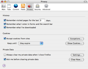
When form elements are encapsulated in a groupbox with a caption, assistive technologies such as screen readers will read the caption along with the label to the form element. For example, under the privacy section of preferences there are three groupboxes captioned: History, Cookies, and Private Data. If the user were to tab to the "Exceptions..." button they would hear "cookies {pause} exceptions {pause} button." The next tab would read "cookies {pause} keep until {pause} they expire {pause} one of three {pause} combobox." If the screen reader only read the label, then the user would have to guess what the "exceptions" button or the "keep until" combobox was referring to.
Groupboxes are essential for radiogroups or groups of checkboxes with a similar theme (e.g. check all that apply). If you find nested groupboxes visually unappealing, use CSS to hide the border of the inner groupbox so that it can remain in the code to benefit users of assistive technologies.
Complex forms sometimes require a more advanced labeling system than is possible with the standard XUL attributes. For example, the first item in the privacy panel in the Firefox option dialog (discussed and shown above) is [checkbox] Remember visited pages for the last [textbox] days. The difficulty here arises from the fact that the correct label for the checkbox ("Remember visited pages for the last x days.") includes three different pieces, the second of which is the current value entered into the textbox. The correct label for textbox is actually the same, but we don't want assistive technologies to read or show it twice. We need a way of specifying in the source that the checkbox, editbox, and nearby text labels are all part of a single entity, and that they essentially label each other.
To solve this problem, we use the aria-labelledby attribute on both controls (note the double L—ARIA uses UK-style spelling) to specify that the checkbox and the textbox are both labeled by the the entire group of components. Put into XUL, this looking something like the following.
  <checkbox id="rememberHistoryDays" aria-labelledby="historyDaysPreLabel historyBox historyDaysPostLabel">
  <label id="historyDaysPreLabel">Remember visited pages for the last</label>
  <textbox id="historyDays" aria-labelledby="historyDaysPreLabel historyBox historyDaysPostLabel"/>
  <label id="historyDaysPostLabel" >days.</label>
The aria-labelledby attribute comes in handy for controls embedded within controls (usually embedded within a checkbox or a radio button). However, in all other cases using <label control="[id]"> is enough.
Testing assistive information
Testing with a screen reader is in many ways the best test, because both the keyboard navigation and underlying semantics/structure of the UI can be tested at the same time. It is an excellent indicator regarding the accessibility of a user interface, but is by no means a complete test. Ultimately, for applications that must be completely accessible, it is best to have the application tested by a variety of end users with different software and assistive technology configurations.
If you don't have access to screen reader software (and don't know anyone who does), your best option is to throughly check the source code to make sure that all of the above guidelines have been met, and then ensure that end users have a way to provide you with feedback on the accessibility (and other aspects) of your application.
Display
It is often said that "presentation is everything." While it is true that presentation is essential, documents should also be structured so that the user can invoke display preferences that may be necessary for accessibility. Presentation should also be flexible to window and font resizing. Cooperative applications adapt well to the user's environment.
System defaults
Maintain system defaults. Many users set their computers to use larger than normal fonts and/or specific color themes. By default, XUL menus, labels, and other widgets get their font, size, and color settings from the user settings specified in the operating system. Respect these defaults unless you have a specific and unavoidable reason to change them. If you must change them, use CSS to size elements relative to the default sizes (for example, use % or em rather than specific point or pixel sizes).
Color
Color is an important tool. Different colors can give different meanings to objects and text. However, color alone is inadequate for conveying meaning or information to the user. Some users may override the default color scheme of your application. Color should only be used to enhance the meaning of an object or text after that meaning is also communicated another way.
Flexible sizing
One of the great things about XUL is that visual layout is easy to control. On the web, visual design is often contained to a specific size. With XUL you can allow elements to flex with the resizing of the application window. Use the flex attribute to provide this functionality.
Testing display
Verify that your application is functional and pleasant looking using user-defined font and color settings. Do this by changing system display settings to an accessible theme (such as the high-contrast theme on windows, available via Left-alt + Left-shift + Printscreen). Confirm that text is emphasized correctly and that color is not used as a sole means to convey meaning. Ensure that when windows are resized, the application adjusts gracefully.
Human computer interaction
As you use an application you expect a certain amount of control and feedback. Provide users with clear instruction and feedback, and allow users to correct errors. Some users with disabilities have difficulties with quick responses. Allow users adequate time to perform tasks.
Instruction
Provide users with help documentation. Even simple applications should include a help document or manual for user reference. Describe keyboard shortcuts and any other accessibility considerations. Users should be able to reference a complete description of all major functionality of an application. Also provide details on how to use long or complex help documentation.
Alerts
Provide accessible alerts for presenting important information to the user. Use scripting or the notificationbox element to flag alerts.
Avoid using audio or visual alerts alone to signal urgent events. Users who have audio turned down or off and users who are deaf or hard of hearing may not be able to recognize audio only alerts. Users with visual disabilities will not be able to observe alerts that are purely visual (unless such alerts are presented in functional text that is accessible to a screen reader).
Interactive elements
Avoid small targets, which are difficult to see and click on. Verify that the layout and contrast is sufficient to distinguish interactive elements one from another and from static portions of the application.
Error recovery
When the user causes an error in an application allow for graceful recovery. For example, if the user provides letters where numbers are required in a form, this should not break the application. The user should be alerted to the problem and allowed to fix the error.
Response time
When appropriate, alert the user to time limits and allow the user to adjust a time limit or request more time. One of the miracles of modern technology is that it allows people with even the most severe physical limitations to use computers. Some users use mouth sticks or movement detection devices such as eye tracking to type. This process can be slow. Other users need time to cognitively process what is happening in the application.
Testing human computer interaction
Ensure that help documentation is up to date. Verify that alerts are displayed through appropriate XUL elements. Ensure the user is informed of any user based errors and that instruction and opportunity for reperforming error causing actions is allowed. Ensure that users have control of response time.
Media
Audio
Informative audio files such as podcasts can be made accessible by supplying a word-for-word transcript. Transcripts should identify the speakers and describe other relevant sounds such as laughing or singing. Transcripts can be time consuming to generate, but is the only way to make audio content accessible.
Video
A video file can be made accessible by adding synchronized captions. Most media delivery formats provide a means for displaying captions. Video should also have descriptive transcripts. Usually captioning and transcribing go hand in hand, once you have one its easy to produce the other.
| Captioning |
|---|
| WebAIM article: Web Captioning Overview WebAIM resource: Captioning Resources |
Animation
Animation, movement, and audio can all be distracting to some users with attention disorders. Provide a mechanism for turning media and movement on and off.
Flickering or flashing is not only just annoying to everyone, but at a rate more than 3 cycles per second it can cause a seizure in users with Photosensitive Epilepsy. If flickering or flashing is necessary then warn the user before it is displayed.
Testing media
Ensure that media alternatives are available in an accessible format.
Other issues
Custom widgets
Avoid re-creating functionality that already exists. Ensure that custom components are built with accessibility in mind. Use CSS system colors to ensure that new widgets interact well with other widgets and with user-defined colors and themes.
| Accessible Custom Widgets |
|---|
| Accessible DHTML Building accessible custom components in XUL |
XUL accessibility checklist
Use the following checklist to quickly verify the accessibility of a new XUL application, or as a starting point for fixing accessibility problems in an existing one.
Keyboard access
| Checkpoint | Pass | Fail |
|---|---|---|
| Tab order | Logical tab order is provided. | Tab order jumps around unexpectedly. |
| Trees | Keyboard functionality is provided for inaccessible features such as the column picker or added features such as column sorting. | Keyboard functionality is not provided for column picker and other features. |
| Toolbarbuttons | Keyboard alternatives are provided for toolbarbutton functionality. | Keyboard alternatives are not provided for toolbarbutton functionality. |
| Keyboard shortcuts | Keyboard shortcuts are present for important functionality | Keyboard shortcuts are not provided. |
| Context menus | Context menus are triggered by the oncontextmenu event handler. | Context menus are hard coded to a right mouse click or other specific trigger. |
| Mouse dependent scripting | All mouse operations have keyboard accessible equivalents. | Operations exist that can only be performed with a mouse. |
| Scrolling | All scrollable elements are controllable with the keyboard. | Scrolling cannot be performed with a keyboard. |
| Focus | Keyboard focus is maintained and does not move unexpectedly. | Focus moves or is disabled unexpectedly. |
Assistive information
| Checkpoint | Pass | Fail |
|---|---|---|
| Alternative text | Alternative text is provided for meaningful images. | Alternative text is missing on meaningful images, or it is inappropriate for the function of an image. |
| Title | All windows, including dialogs and wizards, have a descriptive title. | Windows lack a title or have a incorrect title. |
| Form labels | Every form element has an associated label and radiobuttons are encapsulated in a groupbox. | Form elements are missing labels or the labels are not programmatically connected or radiobuttons are not contained in a groupbox. |
Display
| Checkpoint | Pass | Fail |
|---|---|---|
| System defaults | System settings are maintained. | System settings are not maintained. |
| Color | Color alone is not used to convey meaning and sufficient contrast exists between font color and background color. | Color alone is used to convey meaning, or font and background color do not provide sufficient contrast. |
| Flex | Visual elements and containers resize gracefully. | Visual elements and containers do not resize gracefully. |
Human computer interaction
| Checkpoint | Pass | Fail |
|---|---|---|
| Instruction | Help documentation is provided including a description of keyboard shortcuts. | Help documentation is not provided or is incomplete. |
| Alerts | Alerts are displayed using the alert scripting function or the notificationbox element. | Alerts are conveyed visually or audibly, or use a method other than the alert scripting function or the notificationbox element. |
| Interactive elements | Interactive elements are sufficiently large and visible. | Interactive elements are too small or not sufficiently contrasted from other parts of the application. |
| Error recovery | Alerts are presented when the user initiates an error. The user has the opportunity and instruction to fix the error. | No error alerts exist, or inadequate instruction is provided. |
| Response time | User is informed of time limits and has control of response time when appropriate. | User is not notified of time limits and/or has no control over response time when appropriate. |
Media
| Checkpoint | Pass | Fail |
|---|---|---|
| Audio | Transcripts are provided for audio tracks. | No transcript provided. |
| Video | Video is captioned and a transcript is provided. | No captions and/or transcripts provided. |
| Animation | User has control over animation and is warned about flashing content. | No control over animation or warnings about flashing exist. |
Other
| Checkpoint | Pass | Fail |
|---|---|---|
| Custom widgets | Custom widgets provide accessible functionality. | Custom widgets are inaccessible. |
Further References
- The official W3C Accessibility Guidelines, soon to be released: 2.0 and Techniques for 2.0 which will supercede 1.0. These include language-neutral guidelines and also refer to techniques for XHTML, which is relevant for XUL, as HTML can also be included inside of XUL by use of the XHTML namespace.