
A box which provides scroll arrows along its edges for scrolling through the contents of the box. The user only needs to hover the mouse over the arrows to scroll the box. This element is typically used for large popup menus.
Hovering the mouse over one of the (active) arrows triggers a scroll event.
More information is available in the XUL Tutorial.
- Attributes
- clicktoscroll, disabled, smoothscroll, tabindex
- Properties
- disabled, scrollBoxObject, scrollIncrement, smoothScroll, tabIndex
Examples
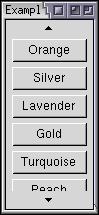
<arrowscrollbox orient="vertical" flex="1">
  <button label="Red"/>
  <button label="Blue"/>
  <button label="Green"/>
  <button label="Yellow"/>
  <button label="Orange"/>
  <button label="Silver"/>
  <button label="Lavender"/>
  <button label="Gold"/>
  <button label="Turquoise"/>
  <button label="Peach"/>
  <button label="Maroon"/>
  <button label="Black"/>
</arrowscrollbox>
Attributes
Inherited from XUL element |
clicktoscroll- Type: boolean
clicktoscroll, if true, the arrows must be clicked to scroll the scrollbox content. If false, the mouse must be hovered over the arrows to scroll automatically.
disabled- Type: boolean
- Indicates whether the element is disabled or not. If this attribute is set, the element is disabled. Disabled elements are usually drawn with grayed-out text. If the element is disabled, it does not respond to user actions, it cannot be focused, and the
commandevent will not fire. In the case of form elements, it will not be submitted. Do not set the attribute totrue, as this will suggest you can set it tofalseto enable the element again, which is not the case.Thedisabledattribute is allowed only for form controls. Using it with an anchor tag (an<a>link) will have no effect.The element will, however, still respond to mouse events. To enable the element, leave this attribute out entirely. - Visible controls have a
disabledproperty which, except for menus and menuitems, is normally preferred to use of the attribute, as it may need to update additional state.
-
smoothscroll - Type: boolean
-
trueinitially enables smooth scrolling for the correspondingarrowscrollbox,falsedisables it. Currently, smooth scrolling supports horizontal arrowscrollboxes only.
tabindex- Type: integer
- The tab order of the element. The tab order is the order in which the focus is moved when the user presses the "
tab" key. Elements with a highertabindexare later in the tab sequence.
Properties
| Inherited Properties |
scrollBoxObject- Type:
nsIScrollBoxObject - The scroll box object implements the
nsIScrollBoxObjectinterface, which may be used to retrieve and adjust the scroll position of the list box.
scrollIncrement- Type: integer
- A read only property that lets you retrieve the number of pixels by which scrolling will occur when the
arrowscrollboxis clicked.
-
smoothScroll - Type: boolean
-
Can be set to enable or disable smooth scrolling for the corresponding
arrowscrollbox. If not set explicitly, it will fall back to thesmoothscrollattribute and then to thetoolkit.scrollbox.smoothScrollpreference. Currently, smooth scrolling supports horizontal arrowscrollboxes only.
Methods
ensureElementIsVisible( element )- Return type: no return value
- If the specified element is not currently visible to the user, the displayed items are scrolled so that it is. If the item is already visible, no scrolling occurs.
-
scrollByIndex( lines ) - Return type: no return value
-
Scrolls the contents of the
arrowscrollboxby a certain number of lines. A line is a single element. Use a positive value as the lines argument to scroll forward that many lines, or a negative value to scroll backward that many lines.
-
scrollByPixels( pixels ) - Return type: no return value
-
Scrolls the contents of the
arrowscrollboxby a certain number of pixels. Use a positive value as the pixels argument to scroll forward that many pixels, or a negative value to scroll backward that many pixels.