
When you design user interfaces with accessibility in mind, they will work for more people. This page describes a number of design-related aspects to look out for, in no particular order.
Color
Enough contrast
Ensure there is enough contrast between foreground and background colors. Your content can then be better consumed by users with low vision and people with color deficiencies.
The ratio should be 4.5:1 for regular text and 3:1 for large text. Calculating this ratio is easiest done with a tool, for example Lea Verou's Contrast Ratio.
There are also plug-ins available for design software, like Stark for Sketch.
Don't rely on color alone
When your interface uses color to distinguish between things, make sure the distinction is also made in other ways. For example, add text labels or texture in addition to color differences.
For example, in this chart, it helps to add labels besides the colored chart lines: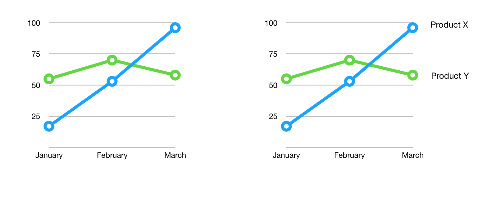 People who cannot see the difference between the colors, can use the labels instead.
Or in this one, you could consider using patterns besides colored areas:
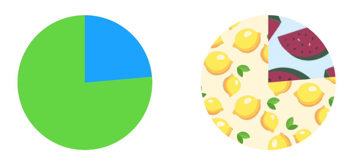
Again, if people are unable to distinguish the colors, they can rely on the patterns instead.
See also: Understanding SC 1.4.3: Contrast
The focus indicator
Users who navigate by keyboard (or other specialised input methods), rely on focus styles to see where they are on the page. Only one element has focus at a given time, typically revealed by browsers with a dotted outline.
CSS lets authors change what the focus indicator look like, so you can design it to match branding.
Here's an example of someone tabbing through a footer, the focus moves around:

Note: don't remove the focus indicator, as without it, users that can't or don't use a mouse cannot see where they are. It would be like removing the mouse indicator.
See also: Understanding SC 2.4.7: focus visible
Be ready for resizing and custom styles
On the web, users can use tools in their browser to make font sizes larger, or even provide custom CSS to meet their specific needs. Ensure your design is flexible enough to allow for this.
Text sizing
Users should be able to enlarge their text size up to 200 percent without breaking functionality.
Text spacing
Users should be able to make the following changes to their text spacing:
- set line height (leading) to at least 1.5 times the font size
- set spacing following paragraphs to at least 2 times the font size
- set letter spacing (tracking) to at least 0.12 times the font size
- set word spacing to at least 0.16 times the font size
This does not mean that your page needs to offer controls to make such changes, merely that if someone does these things in a custom stylesheet, they should not break the interface.
Forms
In forms, provide labels for all controls. This includes form elements like inputs and select boxes, but also buttons.
For form elements, it should be clear what kind of input is expected. Placeholders are best avoided for this, as they are often too low in contrast. It is more helpful to describe what an input element is for in text just above or underneath the input.
Error recovery
When you detect users provide unexpected input, explain what is wrong and, if possible, how to correct it. This is specifically important in these cases:
- the user input is about legal commitments or financial transactions
- it updates or removes the user's data in a system
- when recording tests responses
In those cases, ensure users can change submissions, automatically check for errors. Or provide an opportunity to review the input before submitting it.
Use default controls
Controls that are built into browsers come with a lot of accessibility for free. For example, the select element displays an ideal mobile interface on mobile operating systems like Android and iOS. On desktop with a keyboard, it lets people type a character, say ‘K’, to jump directly to options starting with ‘K’. It is recommended to use native controls, visibly or under the hood.
Links vs buttons
To keep your interface in line with user expectations, use links for interactions that go somewhere (on the current page or another page) and buttons for interactions that do something (like submit a form or open an overlay).
Links can be styled as buttons and vice versa, but designers are advised to avoid this where possible.
Motion
On pages with transitions and animations, note that some users could experience distraction, dizziness or nausea. Pages with a parallax effect can particularly cause troubles.
To help these users, you could offer a setting to turn off animations, or wrap the CSS in the prefers-reduce-motion media query.
See also: Understanding Success Criterion 2.3.3: Animation from Interactions
Content on hover or focus
If content is revealed on hover or focus, for example in tooltips, there are some things to keep in mind:
- if the extra content obscures existing content, there should be a way to close it without moving focus
- if the extra content is opened on hover, hovering the additional content itself should not cause it to disappear
Consistent navigation
Navigation should be consistent across different pages on your site. It does not need to be exactly the same, it is fine to have a different current menu item or different subnavigation links. Do make sure they appear in the same place. That way, users of screen readers and screen magnifiers can reliably make assumptions about them and skip over them.
See also: Understanding Success Criterion 3.2.3: Consistent Navigation
Headings
The heading structure of a page is like its table of contents, so it is important that the levels are consistent. The most important thing about consistent headings is that no levels are skipped. For example: after a level 2 heading, the first subheading would be a level 3, and never a level 4 or 5. Just like in contracts, if there is a 1.2.4 paragraph, you would expect there to be a paragraph 1.2, of which it is a subsection.
Many screenreaders users navigate by headings. For them it is important that no levels are skipped in the HTML. Designers are encourage to also not skip levels in designs.
See also: heading elements
Join the Mozilla Accessibility Community
Live Chat
Both end users and developers are invited for discussion on the live IRC channel at irc.mozilla.org/#accessibility. Since this is a worldwide effort, there is always a good chance to find someone to chat with there, day or night.
Newsgroup and Mailing List
We have two discussion lists, which can be read via a newsgroup reader, as a mailing list or via Google groups.
| Purpose | Newsgroup | Mailing list | Google group |
|---|---|---|---|
| Developer discussion | mozilla.dev.accessibility | subscribe/unsubscribe | Google group |
| End user support | mozilla.support.accessibility | subscribe/unsubscribe | Google group |