
XUL has a set of elements for creating tabular grids.
XUL Tabular Layout
XUL has a set of elements for doing layout of elements in a grid-like manner using the gridtable tag. The grid does not display anything itself; it is used only to position elements in a tabular form with rows and columns.
A grid contains elements that are aligned in rows just like tables. Inside a grid
Declaring a grid
To declare a set of rows, use the rowsgridrow
Similarly, the columns are declared with the columnsgridcolumn
This should be easier to understand with an example.
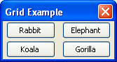
<grid flex="1">

  <columns>
    <column flex="2"/>
    <column flex="1"/>
  </columns>

  <rows>
    <row>
      <button label="Rabbit"/>
      <button label="Elephant"/>
    </row>
    <row>
      <button label="Koala"/>
      <button label="Gorilla"/>
    </row>
  </rows>

</grid>
Two rows and two columns have been added to a grid. Each column is declared with the columnflexrowtd element. Instead, you put the contents of cells directly in the row
Grid with more elements
You can use any element in place of the buttonhboxhbox is a single element but you can put as many elements that you want inside it. For example:
<grid flex="1">

  <columns>
    <column/>
    <column flex="1"/>
  </columns>

  <rows>
    <row>
      <label control="doctitle" value="Document Title:"/>
      <textbox id="doctitle" flex="1"/>
    </row>
    <row>
      <label control="docpath" value="Path:"/>
      <hbox flex="1">
        <textbox id="docpath" flex="1"/>
        <button label="Browse..."/>
      </hbox>
    </row>
  </rows>

</grid>
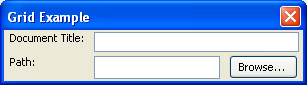
Notice in the image how the first column of elements containing the labels has only a single element in each row. The second column contains a box in its second row, which in turn contains two elements, a textboxbutton
If you resize the window of the last example, you will see that the textboxes resize, but no other elements do. This is because of the flex
The initial width of a column is determined by the largest element in the column. Similarly, the height of a row is determined by the size of the elements in a row. You can use the minwidthmaxwidth
Column based organization
You can also place the elements inside the column
<grid>
  <rows>
    <row/>
    <row/>
    <row/>
  </rows>

  <columns>
    <column>
      <label control="first" value="First Name:"/>
      <label control="middle" value="Middle Name:"/>
      <label control="last" value="Last Name:"/>
    </column>
    <column>
      <textbox id="first"/>
      <textbox id="middle"/>
      <textbox id="last"/>
    </column>
  </columns>

</grid>
This grid has three rows and two columns. The rowflexcolumn
If you put content in both the columns and the rows, the content will overlap each other, although they will align in a grid properly. It creates an effect much like a grid of stack
The order of the elements in the gridrows element is placed after the columns element, the content within the rows is displayed on top. If the columns element is placed after the rows element, the content within the columns is displayed on top. Similarly, events such as mouse buttons and keypresses are sent only to the set on top. This is why the columns were declared after the rows in the above example. If the columns has been placed first, the rows would have grabbed the events and you would not be able to type into the fields.
Flexibility of grids
One advantage that grids have over a set of nested boxes is that you can create cells that are flexible both horizontally and vertically. You can do this by putting a flex
<grid flex="1">
 <columns>
  <column flex="5"/>
  <column/>
  <column/>
 </columns>
 <rows>
  <row flex="10">
    <button label="Cherry"/>
    <button label="Lemon"/>
    <button label="Grape"/>
  </row>
  <row flex="1">
    <button label="Strawberry"/>
    <button label="Raspberry"/>
    <button label="Peach"/>
  </row>
 </rows>
</grid>
The first column and both rows have been made flexible. This will result in every cell in the first column being flexible horizontally. In addition, every cell will be flexible vertically because both rows are flexible, although the first row is more so. The cell in the first column and first row (the Cherry button) will be flexible by a factor of 5 horizontally and flexible by a factor of 10 vertically. The next cell, (Lemon) will only be flexible vertically.
The flexgrid
Column Spanning
There is no means of making a cell span a particular number of multiple columns or rows (See Discussion for a way of achieving the same effect). However, it is possible to make a row or column that spans the entire width or height of the grid. To do this, just add an element inside the rows element that isn't inside a row element. You can use a box type for example, and put other elements inside it if you want to use several elements. Here is a simple example:
<grid>
  <columns>
    <column flex="1"/>
    <column flex="1"/>
  </columns>

  <rows>
    <row>
      <label value="Northwest"/>
      <label value="Northeast"/>
    </row>
    <button label="Equator"/>
    <row>
      <label value="Southwest"/>
      <label value="Southeast"/>
    </row>
  </rows>
</grid>
The button will stretch to fit the entire width of the grid as it is not inside a grid row. You can use a similar technique to add an element in-between two columns. It would stretch to fit the height of the grid. You could also do both if that is desired.
Next, we'll look at adding content panels.