
The Web Animations API lets us construct animations and control their playback with JavaScript. This article will start you off in the right direction with fun demos and tutorials featuring Alice in Wonderland.
Meet the Web Animations API
The Web Animations API opens the browser’s animation engine to developers and manipulation by JavaScript. This API was designed to underlie implementations of both CSS Animations and CSS Transitions, and leaves the door open to future animation effects. It is one of the most performant ways to animate on the Web, letting the browser make its own internal optimizations without hacks, coercion, or Window.requestAnimationFrame().
With the Web Animations API, we can move interactive animations from stylesheets to JavaScript, separating presentation from behavior. We no longer need to rely on DOM-heavy techniques such as writing CSS properties and scoping classes onto elements to control playback direction. And unlike pure, declarative CSS, JavaScript also lets us dynamically set values from properties to durations. For building custom animation libraries and creating interactive animations, the Web Animations API might be the perfect tool for the job. Let's see what it can do!
Browser Support
The basic Web Animations API features discussed in this article are available by default in Firefox 48+ and Chrome 36+. Safari supports Web Animations in its Technology Preview version and there is also a handy polyfill that tests for feature support and adds it where necessary.
Writing CSS Animations with the Web Animations API
One of the more familiar ways to approach learning the Web Animations API is to start with something most web developers have played with before: CSS Animations. CSS Animations have a familiar syntax that breaks down nicely for demonstration purposes.
The CSS version
Here’s a tumbling animation written in CSS showing Alice falling down the rabbit hole that leads to Wonderland (see the full code on Codepen):
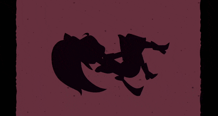
Notice that the background moves, Alice spins, and her color changes at an offset from her spinning. We’re going to focus on just Alice for this tutorial. Here’s the simplified CSS that controls Alice’s animation:
#alice {
  animation: aliceTumbling infinite 3s linear;
}

@keyframes aliceTumbling {
  0% {
    color: #000;
    transform: rotate(0) translate3D(-50%, -50%, 0);
  }
  30% {
    color: #431236;
  }
  100% {
    color: #000;
    transform: rotate(360deg) translate3D(-50%, -50%, 0);
  }
}
This changes Alice’s color and her transform’s rotation over 3 seconds at a constant (linear) rate and loops infinitely. In the @keyframes block we can see that 30% of the way through each loop (about .9 seconds in), Alice’s color changes from black to a deep burgundy then back again by the end of the loop.
Moving it to JavaScript
Now let’s try creating the same animation with the Web Animations API.
Representing keyframes
The first thing we need is to create a Keyframe Object corresponding to our CSS @keyframes block:
var aliceTumbling = [
  { transform: 'rotate(0) translate3D(-50%, -50%, 0)', color: '#000' },
  { color: '#431236', offset: 0.3},
  { transform: 'rotate(360deg) translate3D(-50%, -50%, 0)', color: '#000' }
];
Here we’re using an array containing multiple objects. Each object represents a key from the original CSS. However, unlike CSS, the Web Animations API doesn’t need to explicitly be told the percentages along the animation for each key to appear at. It will automatically divide the animation into equal parts based on the number of keys you give it. This means that a Keyframe object with three keys will play the middle key 50% of the way through each loop of the animation unless told otherwise.
When we want to explicitly set a key’s offset from the other keys, we can specify an offset directly in the object, separated from the declaration with a comma. In the above example, to make sure that Alice’s color changes at 30% (not 50%) for the color change, we are giving it offset: 0.3.
Currently, there should be at least two keyframes specified (representing the starting and ending states of the animation sequence). If your keyframe list has only one entry, Element.animate() may throw a NotSupportedError exception in some browsers until they are updated.
So to recap, the keys are equally spaced by default unless you specify an offset on a key. Handy, no?
Representing timing properties
We’ll also need to create an object of timing properties (an AnimationEffectTimingProperties object) corresponding to the values in Alice’s animation:
var aliceTiming = {
  duration: 3000,
  iterations: Infinity
}
You’ll notice a few differences here from how equivalent values are represented in CSS:
- For one, the duration is in milliseconds as opposed to seconds — 3000 not 3s. Like
WindowTimers.setTimeout()andWindow.requestAnimationFrame(), the Web Animations API only takes milliseconds. - The other thing you’ll notice is that it’s
iterations, notiteration-count.
There are a number of small differences between the terminology used in CSS Animations and the terminology used in Web Animations. For instance, Web Animations doesn't use the string "infinite", but instead uses the JavaScript keyword Infinity. And instead of timing-function we use easing. We aren’t listing an easing value here because, unlike CSS Animations where the default animation-timing-function is ease, in the Web Animations API the default easing is linear — which is what we want here.
Bring the pieces together
Now it’s time to bring them both together with the Element.animate() method:
document.getElementById("alice").animate(
  aliceTumbling,
  aliceTiming
)
And boom: the animation starts playing (see the finished version on Codepen).
The animate() method can be called on any DOM element that could be animated with CSS. And it can be written in several ways. Instead of making objects for keyframes and timing properties, we could just pass their values in directly, like so:
document.getElementById("alice").animate(
  [
    { transform: 'rotate(0) translate3D(-50%, -50%, 0)', color: '#000' },
    { color: '#431236', offset: 0.3},
    { transform: 'rotate(360deg) translate3D(-50%, -50%, 0)', color: '#000' }
  ], {
    duration: 3000,
    iterations: Infinity
  }
);
What’s more, if we only wanted to specify the duration of the animation and not its iterations (by default, animations iterate once), we could pass in the milliseconds alone:
document.getElementById("alice").animate(
  [
    { transform: 'rotate(0) translate3D(-50%, -50%, 0)', color: '#000' },
    { color: '#431236', offset: 0.3},
    { transform: 'rotate(360deg) translate3D(-50%, -50%, 0)', color: '#000' }
  ], 3000);
Controlling playback with play(), pause(), reverse(), and updatePlaybackRate()
While we can write CSS Animations with the Web Animations API, where the API really comes in handy is manipulating the animation’s playback. The Web Animations API provides several useful methods for controlling playback. Let’s take a look at pausing and playing animations in the Growing/Shrinking Alice game (check out the full code on Codepen):
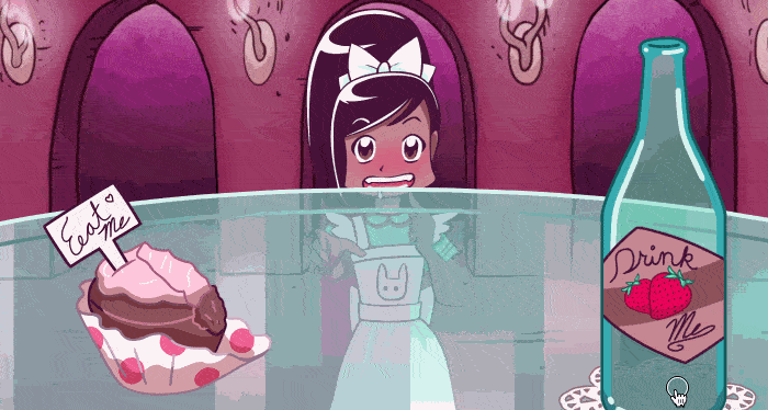
In this game, Alice has an animation that causes her to go from small to big which we control via a bottle and a cupcake. Both of these have their own animations.
Pausing and playing animations
We’ll talk more about Alice’s animation later, but for now, let’s look closer at the cupcake’s animation:
var nommingCake = document.getElementById('eat-me_sprite').animate(
[
  { transform: 'translateY(0)' },
  { transform: 'translateY(-80%)' }
], {
  fill: 'forwards',
  easing: 'steps(4, end)',
  duration: aliceChange.effect.timing.duration / 2
});
The Element.animate() method will immediately run after it is called. To prevent the cake from eating itself up before the user has had the chance to click on it, we call Animation.pause() on it immediately after it is defined, like so:
nommingCake.pause();
We can now use the Animation.play() method to run it whenever we’re ready:
nommingCake.play();
Specifically, we want to link it to Alice’s animation, so she gets bigger as the cupcake gets eaten. We can achieve this via the following function:
var growAlice = function() {

  // Play Alice's animation.
  aliceChange.play();

  // Play the cake's animation.
  nommingCake.play();

}
When a user holds their mouse down or presses their finger on the cake on a touch screen, we can now call growAlice to make all the animations play:
cake.addEventListener("mousedown", growAlice, false);
cake.addEventListener("touchstart", growAlice, false);
Other useful methods
In addition to pausing and playing, we can use the following Animation methods:
Animation.finish()skips to the end of the animation.Animation.cancel()aborts the animation and removes its effects.Animation.reverse()sets the animation’s playback rate (Animation.playbackRate) to a negative value so it runs backward.
Let’s take a look at playbackRate first — a negative playbackRate will cause an animation to run in reverse. When Alice drinks from the bottle, she grows smaller. This is because the bottle changes her animation’s playbackRate from 1 to -1:
var shrinkAlice = function() {
  aliceChange.playbackRate = -1;
  aliceChange.play();
}

bottle.addEventListener("mousedown", shrinkAlice, false);
bottle.addEventListener("touchstart", shrinkAlice, false);
In Through the Looking-Glass, Alice travels to a world where she must run to stay in place — and run twice as fast to move forward! In the Red Queen’s Race example, Alice and the Red Queen are running to stay in place (check out the full code on Codepen):
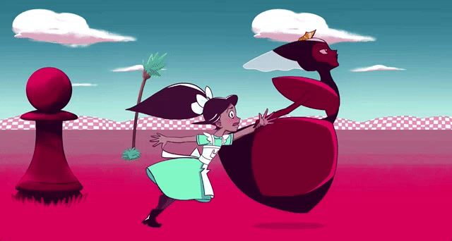
Because small children tire out easily, unlike automaton chess pieces, Alice is constantly slowing down. We can do this by setting a decay on her animation’s playbackRate. We use updatePlaybackRate() instead of setting the playbackRate directly since that produces a smooth update:
setInterval( function() {

  // Make sure the playback rate never falls below .4
  if (redQueen_alice.playbackRate > .4) {
    redQueen_alice.updatePlaybackRate(redQueen_alice.playbackRate * .9);
  }

}, 3000);
But urging them on by clicking or tapping causes them to speed up by multiplying their playbackRate:
var goFaster = function() {
  redQueen_alice.updatePlaybackRate(redQueen_alice.playbackRate * 1.1);
}

document.addEventListener("click", goFaster);
document.addEventListener("touchstart", goFaster);
The background elements also have playbackRates that are impacted when you click or tap. What happens when you make Alice and the Red Queen run twice as fast? What happens when you let them slow down?
Getting information out of animations
Imagine other ways we could use playbackRate, such as improving accessibility for users with vestibular disorders by letting them slow down animations across an entire site. That’s impossible to do with CSS without recalculating durations in every CSS rule, but with the Web Animations API, we could use the document.getAnimations() method to loop over each animation on the page and halve their playbackRates, like so:
document.getAnimations().forEach(
  function (animation) {
    animation.updatePlaybackRate(animation.playbackRate * .5);
  }
);
With the Web Animations API, all you need to change is just one little property!
Another thing that’s tough to do with CSS Animations alone is creating dependencies on values provided by other animations. For instance, in the Growing and Shrinking Alice game example, you might have noticed something odd about the cake’s duration:
duration: aliceChange.effect.getComputedTiming().duration / 2
To understand what’s happening here, let’s take a look at Alice’s animation:
var aliceChange = document.getElementById('alice').animate(
  [
    { transform: 'translate(-50%, -50%) scale(.5)' },
    { transform: 'translate(-50%, -50%) scale(2)' }
  ], {
    duration: 8000,
    easing: 'ease-in-out',
    fill: 'both'
  });
Alice’s animation has her going from half her size to twice her size over 8 seconds. Then we pause her:
aliceChange.pause();
If we had left her paused at the beginning of her animation, she’d start at half her full size, as if she’d drunk the entire bottle already! We want to set her animation’s “playhead” in the middle, so she’s already halfway done. We could do that by setting her Animation.currentTime to 4 seconds, like so:
aliceChange.currentTime = 4000;
But while working on this animation, we might change Alice’s duration a lot. Wouldn’t it be better if we set her currentTime dynamically, so we don’t have to make two updates at a time? We can, in fact, do so by referencing aliceChange’s Animation.effect property, which returns an object containing all the details of the effect(s) active on Alice:
aliceChange.currentTime = aliceChange.effect.getComputedTiming().duration / 2;
effect lets us access the animation’s keyframes and timing properties — aliceChange.effect.getComputedTiming() points to Alice’s timing object (which is of type ComputedEffectTiming) — this contains her ComputedEffectTiming.duration. We can divide her duration in half to get the midpoint for her animation’s timeline, setting her to be normal height. Now we can reverse and play her animation in either direction to make her grow smaller or larger!
And we can do the same thing when setting the cake and bottle durations:
var drinking = document.getElementById('liquid').animate(
[
  { height: '100%' },
  { height: '0' }
], {
  fill: 'forwards',
  duration: aliceChange.effect.getComputedTiming().duration / 2
});
drinking.pause();
Now all three animations are linked to just one duration, which we can change easily from one place.
We can also use the Web Animations API to figure out the animation's current time. The game ends when you run out of cake to eat or empty the bottle. Which vignette players are presented with depends on how far along Alice was in her animation, whether she grew too big and can't get in the tiny door anymore or too small and cannot reach the key to open the door. We can figure out whether she's on the large end or small end of her animation by getting her animation's currentTime and dividing it by her activeDuration:
var endGame = function() {

  // get Alice's timeline's playhead location
  var alicePlayhead = aliceChange.currentTime;
  var aliceTimeline = aliceChange.effect.getComputedTiming().activeDuration;

  // stops Alice's and other animations
  stopPlayingAlice();

  // depending on which third it falls into
  var aliceHeight = alicePlayhead / aliceTimeline;

  if (aliceHeight <= .333){
    // Alice got smaller!
    ...

  } else if (aliceHeight >= .666) {
    // Alice got bigger!
    ...

  } else {
    // Alice didn't change significantly
    ...

  }
}
Note: getAnimations() and effect are not shipping in all browsers as of this writing, but the polyfill does support them today.
Callbacks and promises
CSS Animations and Transitions have their own event listeners, and these are also possible with the Web Animations API:
onfinishis the event handler for thefinishevent and can be triggered manually withfinish().oncancelis the event handler for thecancelevent and can be triggers withcancel().
Here we set the callbacks for the cake, bottle, and Alice to fire the endGame function:
// When the cake or bottle runs out...
nommingCake.onfinish = endGame;
drinking.onfinish = endGame;

// ...or Alice reaches the end of her animation
aliceChange.onfinish = endGame;
Better still, the Web Animations API also provides a finish promise that will resolve when the animation finishes, or reject if it is canceled.
Conclusion
These are the basic features of the Web Animations API, most of which are already supported across the latest release versions of Firefox and Chrome. By now you should be ready to "jump down the rabbit hole" of animating in the browser and ready to write your own animation experiments! If you're using the API and want to share, try using the #WAAPI hashtag. We will be watching and will write more tutorials to cover further features as support spreads!
See also
- The full suite of Alice in Wonderland demos on CodePen for you to play with, fork, and share
- Animating like you just don’t care with Element.animate — a great article to read that explains more on the background of the Web Animations API, and why it is more performant than other web animation methods
- web-animations-js — the Web Animations API polyfill