
The <easing-function> CSS data type denotes a mathematical function that describes how fast one-dimensional values change during animations. This lets you vary the animation's speed over the course of its duration.
The easing functions in the cubic-bezier subset of easing functions are often called "smooth" easing functions, because they can be used to smooth down the start and end of the animation. They correlate a time ratio to an output ratio, both expressed as <number>s. For these values, 0.0 represents the initial state, and 1.0 represents the final state.
Depending on the specific function used, the calculated output can sometimes grow to be greater than 1.0 or smaller than 0.0 during the course of an animation. This causes the animation to go farther than the final state, and then return. For some properties, such as left or right, this creates a kind of "bouncing" effect.
However, certain properties will restrict the output if it goes outside an allowable range. For example, a color component greater than 255 or smaller than 0 will be clipped to the closest allowed value (255 and 0, respectively). Some cubic-bezier() curves exhibit this property.
Syntax
There are three types of easing function: linear, cubic Bézier curves, and staircase functions. The value of an <easing-function> type describes the easing function using one of those three types.
Easing functions
CSS supports three kinds of easing functions: linear, the subset of the cubic Bézier curves that are functions, and staircase functions. The most useful of these functions are given a keyword that allows them to be easily referenced.
The linear class of easing functions
linear
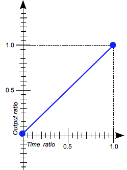
The animation moves from beginning to end at a constant rate. This keyword represents the easing function cubic-bezier(0.0, 0.0, 1.0, 1.0).
The cubic-bezier() class of easing functions
The cubic-bezier() functional notation defines a cubic Bézier curve. As these curves are continuous, they are often used to smooth down the start and end of the animation and are therefore sometimes called easing functions.
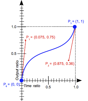
A cubic Bézier curve is defined by four points P0, P1, P2, and P3. P0 and P3 are the start and the end of the curve and, in CSS these points are fixed as the coordinates are ratios (the abscissa the ratio of time, the ordinate the ratio of the output range). P0 is (0, 0) and represents the initial time and the initial state, P3 is (1, 1) and represents the final time and the final state.
Not all cubic Bézier curves are suitable as easing functions as not all are mathematical functions; i.e., curves that for a given abscissa have zero or one value. With P0 and P3 fixed as defined by CSS, a cubic Bézier curve is a function, and is therefore valid, if and only if the abscissas of P1 and P2 are both in the [0, 1] range.
Cubic Bézier curves with the P1 or P2 ordinate outside the [0, 1] range may generate bouncing effects.
When you specify an invalid cubic-bezier curve, CSS ignores the whole property.
Syntax
cubic-bezier(x1, y1, x2, y2)
where:
- x1, y1, x2, y2
- Are
<number>values representing the abscissas, and ordinates of the P1 and P2 points defining the cubic Bézier curve. x1 and x2 must be in the range [0, 1] or the value is invalid.
Keywords for common cubic-bezier easing functions
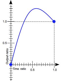
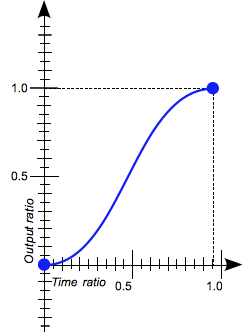
ease
The animation starts slowly, accelerates sharply, and then slows gradually towards the end. This keyword represents the easing function cubic-bezier(0.25, 0.1, 0.25, 1.0). It is similar to ease-in-out, though it accelerates more sharply at the beginning.
ease-in
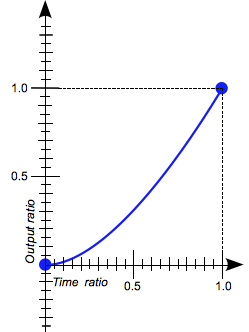
The animation starts slowly, and then progressively speeds up until the end, at which point it stops abruptly. This keyword represents the easing function cubic-bezier(0.42, 0.0, 1.0, 1.0).
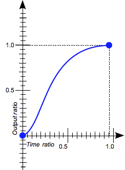
ease-in-out
The animation starts slowly, speeds up, and then slows down towards the end. This keyword represents the easing function cubic-bezier(0.42, 0.0, 0.58, 1.0). At the beginning, it behaves like the ease-in function; at the end, it is like the ease-out function.
ease-out
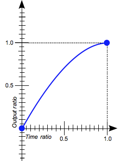
The animation starts abruptly, and then progressively slows down towards the end. This keyword represents the easing function cubic-bezier(0.0, 0.0, 0.58, 1.0).
The steps() class of easing functions
The steps() functional notation defines a step function dividing the domain of output values in equidistant steps.This subclass of step functions are sometimes also called staircase functions.
Syntax
steps(number_of_steps, direction)
where:
- number_of_steps
- Is a strictly positive
<integer>, representing the amount of equidistant treads composing the stepping function. - direction
- Is a keyword indicating if it the function is left- or right-continuous:
-
jump-startdenotes a left-continuous function, so that the first step or jump happens when the animation begins;jump-enddenotes a right-continuous function, so that the last step or jump happens when the animation ends;jump-bothdenotes a right and left continuous function, includes pauses at both the 0% and 100% marks, effectively adding a step during the animation iteration;jump-noneThere is no jump on either end. Instead, holding at both the 0% mark and the 100% mark, each for 1/n of the durationstartis the equivalent ofjump-startendis the equivalent ofjump-end
endis the default.
steps( n, <direction> )
-
steps(2, jump-start)
steps(2, start)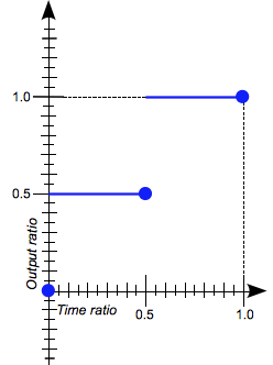
-
steps(4, jump-end)

   steps(4, end)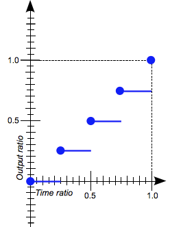
-
steps(5, jump-none)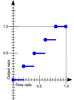
-
steps(3, jump-both)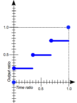
-
steps-start - The equivalent of
steps(1, jump-start) -
steps-end - The equivalent of
steps(1, jump-end)
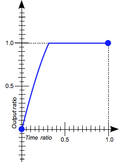
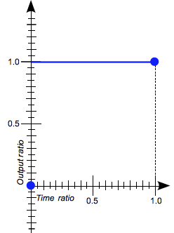
step-start
 The animation jumps immediately to its final state, where it stays until the end. This keyword represents the easing function
 steps(1, jump-start) or steps(1, start).
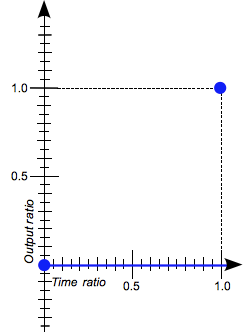
step-end
 The animation stays in its initial state until the end, at which point it jumps directly to its final state. This keyword represents the easing function
 steps(1, jump-end) or steps(1, end).
Examples
Easing function comparison
This example creates an animation that can be started and stopped again using the provided button, and a select menu that can be used to switch its easing function between the available keywords, plus a couple of cubic-bezier() and steps() options. The idea is to provide an easy comparison between different easing functions.
HTML
<div>
  <div></div>
</div>
<ul>
  <li>
    <button class="animation-button">Start animation</button>
  </li>
  <li>
    <label for="easing-select">Choose an easing function:</label>
    <select id="easing-select">
      <option selected>linear</option>
      <option>ease</option>
      <option>ease-in</option>
      <option>ease-in-out</option>
      <option>ease-out</option>
      <option>cubic-bezier(0.1, -0.6, 0.2, 0)</option>
      <option>cubic-bezier(0, 1.1, 0.8, 4)</option>
      <option>steps(5, end)</option>
      <option>steps(3, start)</option>
      <option>steps(4)</option>
    </select>
  </li>
</ul>
CSS
body > div {
  position: relative;
  height: 100px;
}

div > div {
  position: absolute;
  width: 50px;
  height: 50px;
  background-color: blue;
  background-image: radial-gradient(circle at 10px 10px, rgba(25,255,255,0.8),rgba(25,255,255,0.4));
  border-radius: 50%;
  top: 25px;
  animation: 1.5s infinite alternate;
}

@keyframes move-right {
  from {
    left: 10%;
  }

  to {
    left: 90%;
  }
}

li {
  display: flex;
  align-items: center;
  justify-content: center;
  margin-bottom: 20px;
}
JavaScript
const selectElem = document.querySelector('select');
const startBtn = document.querySelector('button');
const divElem = document.querySelector('div > div');

startBtn.addEventListener('click', () => {
  if(startBtn.textContent === 'Start animation') {
    divElem.style.animationName = 'move-right';
    startBtn.textContent = 'Stop animation';
    divElem.style.animationTimingFunction = selectElem.value;
  } else {
    divElem.style.animationName = 'unset';
    startBtn.textContent = 'Start animation';
  }
});

selectElem.addEventListener('change', () => {
  divElem.style.animationTimingFunction = selectElem.value;
});
Result
cubic-bezier() function examples
These cubic Bézier curves are valid for use in CSS:
/* The canonical Bézier curve with four <number> in the [0,1] range. */
cubic-bezier(0.1, 0.7, 1.0, 0.1)

/* Using <integer> is valid as any <integer> is also a <number>. */
cubic-bezier(0, 0, 1, 1)

/* Negative values for ordinates are valid, leading to bouncing effects.*/
cubic-bezier(0.1, -0.6, 0.2, 0)

/* Values > 1.0 for ordinates are also valid. */
cubic-bezier(0, 1.1, 0.8, 4)
These cubic Bézier curves definitions are invalid:
/* Though the animated output type may be a color,
   Bézier curves work w/ numerical ratios.*/
cubic-bezier(0.1, red, 1.0, green)

/* Abscissas must be in the [0, 1] range or
   the curve is not a function of time. */
cubic-bezier(2.45, 0.6, 4, 0.1)

/* The two points must be defined, there is no default value. */
cubic-bezier(0.3, 2.1)

/* Abscissas must be in the [0, 1] range or
   the curve is not a function of time. */
cubic-bezier(-1.9, 0.3, -0.2, 2.1)
steps() function examples
These easing functions are valid:
/* There is 5 treads, the last one happens
   right before the end of the animation. */
steps(5, end)

/* A two-step staircase, the first one happening
   at the start of the animation. */
steps(2, start)

/* The second parameter is optional. */
steps(2)
These easing function are invalid:
/* The first parameter must be an <integer> and
   cannot be a real value, even if it is equal to one. */
steps(2.0, jump-end)

/* The amount of steps must be non-negative. */
steps(-3, start)

/* There must be at least one step.*/
steps(0, jump-none)
Specifications
| Specification | Status | Comment |
|---|---|---|
| CSS Animations The definition of '<timing-function>' in that specification. |
Working Draft | Defines <single-timing-function> as a synonym for <single-transition-timing-function> of the CSS Transitions Module. |
| CSS Timing Functions Level 1 The definition of '<easing-function>' in that specification. |
Working Draft | Initial definition. |
Browser compatibility
| Desktop | Mobile | |||||||||||
|---|---|---|---|---|---|---|---|---|---|---|---|---|
<easing-function> | Chrome Full support 4 | Edge Full support 12 | Firefox Full support 4 | IE Full support 10 | Opera Full support 10.5 | Safari Full support 3.1 | WebView Android Full support 4 | Chrome Android Full support 18 | Firefox Android Full support 4 | Opera Android Full support 11 | Safari iOS Full support 2 | Samsung Internet Android Full support 1.0 |
cubic-bezier() with ordinate ∉ [0,1] | Chrome Full support 16 | Edge Full support 12 | Firefox Full support 4 | IE Full support 10 | Opera Full support 12.1 | Safari Full support 6 | WebView Android Full support 4.4 | Chrome Android Full support 18 | Firefox Android Full support 4 | Opera Android Full support 14 | Safari iOS Full support 6 | Samsung Internet Android Full support 1.0 |
steps() with start, end or no direction | Chrome Full support 8 | Edge Full support 12 | Firefox Full support 4 | IE Full support 10 | Opera Full support 12.1 | Safari Full support 5.1 | WebView Android Full support 4 | Chrome Android Full support 18 | Firefox Android Full support 4 | Opera Android Full support 14 | Safari iOS Full support 5 | Samsung Internet Android Full support 1.0 |
steps: jump- keywords for steps() | Chrome Full support 77 | Edge Full support 79 | Firefox Full support 65 | IE No support No | Opera No support No | Safari No support No | WebView Android Full support 77 | Chrome Android Full support 77 | Firefox Android Full support 65 | Opera Android Full support 55 | Safari iOS No support No | Samsung Internet Android No support No |
Legend
- Full support
- Full support
- No support
- No support