
A panel is a popup which can support any type of content. It is used when supporting temporary popup displays for selecting or entering data.
The panel element
The panel element is used to create panels. The panel will display whatever elements are placed as children of the panel element. For example, the following panel displays a textbox for entering a name. Note that the panel is not placed in a separate file and is instead placed inside another window.
<?xml-stylesheet href="chrome://global/skin" type="text/css"?>
<window xmlns="http://www.mozilla.org/keymaster/gatekeeper/there.is.only.xul">

<button label="Details" type="panel">
  <panel id="search-panel">
    <label control="name" value="Name:"/>
    <textbox id="name"/>
  </panel>
</button>

</window>
Many panels will be associated with a button, as in this example. When the button is pressed, the panel is opened. Clicking outside the panel or pressing Escape will close the panel. You can also place a close button in the panel which will close the panel with a script if desired. When you want to associate a panel with a button, place the <panel> element directly inside the button element. You also need to set the type attribute on the button to the value panel, or the button will look and behave like a regular button.
The popup panel will, by default, appear with its topleft corner just underneath the bottom edge of the button, much as a menu does. The position can, however, be changed. For more information about positioning the popup, see Positioning Popups.
Only buttons (and toolbarbuttons) have this automatic behaviour which opens the popup when pressed. For other types of elements, you need to use a different technique as in the following example.
<label value="Search" popup="search-panel"/>

<panel id="search-panel">
  <label control="search" value="Terms:"/>
  <textbox id="search"/>
</panel>
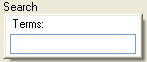
To attach a panel to an non-button element, for instance to have a panel open when a label is clicked, use the popup attribute. The popup attribute should be set to the id of a panel within the same document. When the left mouse button is pressed on the element with the popup attribute, the corresponding panel will be displayed. For instance, to attach the popup defined above to a label, use the following code:
<label value="Search" popup="search-panel"/>
The result is a search button which opens a panel for entering the search term. When using the popup attribute, the panel will appear with the top left corner at the mouse position. In this case, you may wish to have the popup appear below the label instead. The position attribute may be used to control the placement of the popup. Here is a complete example:
<panel id="search-panel" position="after_start">
  <label control="search" value="Terms:"/>
  <textbox id="search"/>
</panel>

<label value="Search" popup="search-panel"/>
The position attribute has been added to the panel element with the value 'after_start'. This causes the panel to be displayed not where the mouse was clicked but aligned along the bottom edge of the label. For more information about this attribute and other possible values that can be used, see Positioning Popups.
It is also possible to open a panel like a context menu using the context attribute instead of the popup attribute. This works just like using context menus except that the panel element is used instead of the menupopup element. See Context Menus for more details on this.
Opening a panel with script
The panel, like all popups, has an openPopup method which may be used to open the popup using a script. For example, the following would open a panel underneath a button:
panel.openPopup(button, "after_start", 0, 0, false, false);
Likewise, the openPopupAtScreen method will open a panel at a specific screen position. For more details about both methods, see Opening and Closing Popups.
Closing a panel
A panel is closed automatically when the user clicks outside of the panel. It is quite common however, to have an element such as a button within the panel to close it as well. For instance, using the search panel example above, we could add a button which closes the panel when pressed:
<script>
function doSearch() {
  document.getElementById("search-panel").hidePopup();
}
</script>

<toolbarbutton label="Search" type="panel">
  <panel id="search-panel" position="after_start">
    <textbox id="search"/>
    <button label="Search" oncommand="doSearch();"/>
  </panel>
</toolbarbutton>
In this example, the doSearch() function is called when the "Search" button is pressed. This function retrieves the popup and calls the hidePopup method. Naturally, this function would also include code to start the search operation.
Preventing panels from automatically closing
A panel will be closed when a user clicks outside of the panel or when the escape key is pressed. This is the normal way in which a user would cancel the operation. You may wish to also place a cancel or close button within the panel, especially if the panel is larger with a lot of controls within it.
Sometimes, however, you may wish to keep the panel open, even if the user clicks outside of it. This is useful when creating floating tool panels. To do this, set the noautohide attribute on the panel to true.
<panel id="search-panel" noautohide="true">
  <textbox id="search"/>
  <button label="Search" oncommand="doSearch();"/>
  <button label="Cancel" oncommand="this.parentNode.hidePopup();"/>
</panel>
Because the panel can no longer be closed by clicking elsewhere, the panel should always provide a means to close the panel itself. In this example a cancel button has been added.
For more information about these types of panels, see Floating Panels.
Focus in panels
Elements within panels may be focused with the mouse, and the currently focused element may be adjusted by pressing the Tab key. When a popup is opened, if an element in the main window is focused, that element is unfocused, and a blur event is fired at it. Although no element within the popup panel is focused by default, the user may focus the first element within the panel by pressing the Tab key. If you want to set the focus to an element by default when a panel is opened, adjust the focus within a popupshown event handler. For instance, to have the textbox initially focused in the example above:
<panel id="search-panel" onpopupshown="document.getElementById('search').focus()">
To disable the adjusting of focus when a panel is opened, set the noautofocus attribute to true:
<panel noautofocus="true">
This will cause the focus to remain on the element within the main window that has focus when the panel is opened. Note that this will also keep the focus within the panel when it is closed.
When a panel is closed, the focus is removed from the element within the panel which has the focus event, if any, and whatever element was focused before the panel was opened is refocused. You can prevent the focus from being removed by setting the noautofocus attribute to true as above. In addition, the norestorefocus attribute should be set to true in order to prevent the previously focused element from being refocused. Normally, only the latter would be set if needed.
This process of removing the focus when opening and closing a popup occurs after the popupshowing event or popuphiding event is fired, which means that if those events are cancelled, the focus is not adjusted.
Letting panels be dragged by grabbing the background
Requires Gecko 7.0(Firefox 7.0 / Thunderbird 7.0 / SeaMonkey 2.4)Starting in Gecko 7.0 (Firefox 7.0 / Thunderbird 7.0 / SeaMonkey 2.4), you can use the backdrag attribute to create panels that the user can drag by clicking and dragging anywhere on their backgrounds. This is a simple, Boolean attribute, so you can enable this feature like this:
<panel backdrag="true">