
A panel is a used as a temporary floating popup window that may contain any type of content. It does not have any window decorations. When open, it floats above the window and may extend outside the border of the main window. Typically, it will be attached to a button using the button's type attribute so that when the button is pressed, the panel will be displayed. A panel may also be opened via a script using the openPopup method.
The panel is closed when the user clicks outside the panel, presses Escape or when the panel's hidePopup method is called.
Warning: For Firefox versions between 3.6 and 4.0, placing an
iframe, browser or editor inside a panel is not supported. Some features may work, but only on some platforms. For those versions of Firefox, it is best to avoid child frames in a panel, if possible. This limitation was resolved as of Firefox 4.0.- Attributes
- backdrag, close, consumeoutsideclicks, fade, flip, ignorekeys, label, left, level, noautofocus, noautohide, norestorefocus, onpopuphidden, onpopuphiding, onpopupshowing, onpopupshown, position, titlebar, top, type
- Properties
- accessibleType, label, popupBoxObject, popup, state
- Methods
- hidePopup, moveTo, openPopup, openPopupAtScreen, sizeTo
Examples
The following example shows how a panel may be attached to a label.
<panel id="thepanel">
  <hbox align="start">
    <image src="warning.png"/>
    <vbox>
      <description value="You have 6 new messages."/>
      <hbox>
        <button label="Read Mail"/>
        <button label="New Message"/>
      </hbox>
    </vbox>
  </hbox>
</panel>
<description value="6 New Messages" popup="thepanel"/>
Attributes
backdrag- Type: boolean
- Setting the
backdragattribute on a XUL panel lets the user move the panel by clicking and dragging anywhere on its background area.
-
close - Type: boolean
-
If the panel has a titlebar, set the panel's close attribute to
trueto have a close button appear on the titlebar. Pressing the close button will close the panel.
-
consumeoutsideclicks - Type: boolean
-
Controls whether or not the event that caused the popup to be automatically dismissed (or "rolled up") should be consumed or be dispatched as a normal event. If it is not set, it defaults to the platform behavior. If it set to
truethe rollup event is consumed. If set tofalse, the rollup event is not consumed. This attribute should be used instead ofsetConsumeRollupEvent.
fade- Type: one of the values below
- The
fadeattribute, which may only be used with arrow panels, lets you set up a panel that will automatically fade away after a short time. The default isnone. -
none- The panels doesn't automatically fade away.
slow- The panels slowly fades away after a short time.
fast- The panels quickly fades away after a short time.
-
flip - Type: string
-
Normally, when a popup opens near the edge of the screen, it flips over to open on the opposite side of the anchor, so that it doesn't extend off the screen. For example, if the menu doesn't have room to open downward, it flips to open upward instead; this is a vertical flip. Horizontal flipping doesn't normally happen, since this would cause menus to open in strange places. For arrow popups, however, being able to flip horizontally makes sense. This attribute, set to
both, permits that behavior. You will not normally have to use this attribute, since it's automatically applied to arrow panels. -
An arrow panel can also specify a value of
slide, which causes the arrow to "slide" instead of flipping when the panel doesn't have room. A sliding panel will have the start (or end) position extended such that the panel can be the requested size, meaning the arrow will no longer be at the start (or end) of the panel - i.e., the arrow will appear to have been slid along the panel to ensure the arrow is still pointing at the anchor. -
-
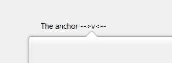
In this image, the panel has
flip="slide"and has a width which is greater than the distance from the anchor to the right of the screen (or window), so the panel extends past the left of the anchor, and the arrow slides towards the middle of the panel such that it is still aligned with the anchor. Withoutflip="slide", the panel would have had its width truncated and the panel would not extend to the left of the anchor.
ignorekeys- Type: boolean
- If
false, the default value, the Escape key may be used to close the panel. Iftrue, the Escape key cannot be used to close the panel.
label- Type: string
- For panels with titlebars, the label on the titlebar.
level- Type: one of the values below
- Specifies whether the panel appears on top of all windows, or just on top of the window the panel is in. If this attribute is not set, the popup window level depends on the platform. On Linux, the default value is
top, otherwise, the default value isparent. If a panel has one or more text fields, this attribute should not be set, otherwise IME or on-screen keyboard popups will appear incorrectly. For these reasons, you should avoid setting the level if not needed. -
top- The panel is shown in front of all other normal windows, including those of other applications.
parent- The panel is shown just above the window the panel is in, but behind other windows above it. If anchored, the child window maintains its relative position to its parent window.
floating- The panel floats above the window the panel is in. On Mac, the panel is only visible when the application is active.
noautofocus- Type: boolean
- If false, the default value, the currently focused element will be unfocused whenever the popup is opened or closed. If true, the focus is not adjusted.
noautohide- Type: boolean
- If
false, the default value, the panel will be hidden when the user clicks outside the panel or switches focus to another application. Iftrue, the panel will only be closed when the hidePopup method is called.
norestorefocus- Type: boolean
- If
false, the default value, then when the panel is hidden, the keyboard focus will be restored to whatever had the focus before the panel was opened. Iftrue, the focus will not be reset, although it will be cleared if the focus is within the panel.
onpopuphiding- Type: script code
- This event is sent to a popup when it is about to be hidden.
onpopupshowing- Type: script code
- This event is sent to a popup just before it is opened. This handler is usually used to dynamically set the contents when the user requests to display it. Returning
falsefrom this event handler prevents the popup from appearing.
onpopupshown- Type: script code
- This event is sent to a popup after it has been opened, much like the
onloadevent is sent to a window when it is opened.
position- Type: string
- The
positionattribute determines where the popup appears relative to the element the user clicked to invoke the popup. This allows you to place the popup on one side of a button. Note that a context menu will never respect this attribute, always appearing relative to the mouse cursor.
This value can be specified either as a single word offering pre-defined alignment positions, or as 2 words specifying exactly which part of the anchor and popup should be aligned.
If specified as 2 words, the value indicates which corner or edge of the anchor (the first word) is aligned which which corner of the popup (the second word). The anchor value (ie, the first word) can be one oftopleft,topright,bottomleft,bottomright,leftcenter,rightcenter,topcenterorbottomcenter. The popup value (ie, the second word) can be one oftopleft,topright,bottomleftorbottomright.
Positions specified as a single word string are shortcuts for the values above. Valid single-word values areafter_start,after_end,before_start,before_end,end_after,end_before,start_after,start_before,overlap,at_pointerorafter_pointer.- For more details, including examples, please see popup positioning
titlebar- Type: string
- Set the panel's titlebar attribute to the value
normalto display a panel with a titlebar. Thenoautohideattribute must be set totrue.
-
type - Type: string
-
The panel type. Should be one of the following:
-
autocomplete - Specify this for a panel that provides a tree for an autocomplete element.
-
autocomplete-richlistbox - Specify this for a panel that provides a richlistbox for an autocomplete element.
-
arrow - Specify this for a panel that provides an arrow pointing at its anchor.
-
drag - Specify this for a panel that's being used as a drag image for a drag and drop operation.
-
Note: The arrow will draw as long as the panel doesn't overlap the anchor. If they overlap, the anchor won't be drawn. The panel may not appear on the side of the anchor that you requested in which case the arrow will automatically adjust.
Properties
-
accessibleType - Type: integer
- A value indicating the type of accessibility object for the element.
-
popupBoxObject -
Type:
nsIPopupBoxObject -
This read-only property holds the
nsIPopupBoxObjectthat implements the popup. You wouldn't normally need to use this property as all of its functions are available via the popup itself.
-
state - Type: string
-
This read only property indicates whether the popup is open or not. Four values are possible:
closed: The popup is closed and not visible.open: The popup is open and visible on screen.showing: A request has been made to open the popup, but it has not yet been shown. This state will occur during the popupshowing event.hiding: The popup is about to be hidden. This state will occur during the popuphiding event.
Methods
-
hidePopup() - Return type: no return value
- Closes the popup immediately.
-
moveTo( x, y ) - Return type: no return value
- Moves the popup to a new location defined by screen coordinates (and not client coordinates).
- If both x and y have the value -1 the call will realign the popup with its anchor node.
-
openPopup( anchor , position , x , y , isContextMenu, attributesOverride, triggerEvent ) - Return type: no return value
Opens the popup relative to a specified node at a specific location.
- anchor
-
The popup may be either anchored to another node or opened freely. To anchor a popup to a node, supply an anchor node and set the position to a string indicating the manner in which the popup should be anchored. The anchor node does not need to be in the same document as the popup. Unanchored popups may be created by supplying
nullas the anchor node. The direction in which the popup is oriented depends on the direction of the anchor. - position
-
Possible values for position are:
before_start,before_end,after_start,after_end,start_before,start_after,end_before,end_after,overlap, andafter_pointer. Check Positioning of the Popup Guide for a precise description of the effect of the different values. - x, y
-
For an anchored popup, the
xandyarguments may be used to offset the popup from its anchored position by some number, measured in CSS pixels. An unanchored popup appears at the position specified by x and y, relative to the viewport of the document containing the popup node. In this case, thepositionandattributesOverridearguments are ignored. - isContextMenu
-
The
isContextMenuargument should betruefor context menus andfalsefor all other types of popups. It affects menu item highlighting; that is, while a context menu is open, menus opened earlier do not highlight or execute their items. - attributesOverride
-
If the
attributesOverrideargument istrue, the position attribute on the popup node overrides thepositionvalue argument. IfattributesOverrideisfalse, the attribute is only used if thepositionargument is empty. - triggerEvent
- The event that triggered the popup (such as a mouse click, if the user clicked something to open the popup).
-
openPopupAtScreen( x, y, isContextMenu ) - Return type: no return value
- Open the popup at a specific screen position specified by x and y. This position may be adjusted if it would cause the popup to be off of the screen. The x and y coordinates are measured in CSS pixels.
-
sizeTo( width, height ) - Return type: no return value
- Changes the current size of the popup to the new width and height.
Related
- Interfaces
nsIAccessibleProvider,nsIDOMXULPopupElement