
We've seen a lot of features of the box model. Here, we'll find out some more details with some examples.
More Layout Details
The style properties such as min-width and max-height can be applied to any element. We've added them to buttons and textboxes, but we can also add them to spacers or boxes. In addition, the flex attribute can be applied to any element.
<hbox flex="1">
  <button label="Left" style="min-width: 100px;" flex="1"/>
  <spacer flex="1"/>
  <button label="Right" style="min-width: 100px;" flex="1"/>
</hbox>
In the example above, all three elements will resize themselves as they are all flexible. The two buttons indicate a minimum width of 100 pixels. The buttons will never be smaller than this size but they may grow larger. Here the window should appear just over 200 pixels wide. That's enough for the two buttons. Because all three elements are flexible, but they don't need any more room, the flexibility adds no extra space.
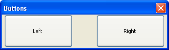
As shown in the image, there are two buttons which expand vertically to fit their container, which in this case is the hboxalign
<hbox flex="1" align="top">
  <button label="Left" style="min-width: 100px;" flex="1"/>
  <spacer flex="1"/>
  <button label="Right" style="min-width: 100px;" flex="1"/>
</hbox>
Summary of the box model
To achieve complicated layouts, you will generally need to add nested boxes, specify minimum and maximum sizes on some elements, and make certain elements flexible. The best interface is one that can be displayed at various sizes without problems. The box model may be difficult to understand without trying various various things out for yourself.
The following is an outline of both types of boxes:
Horizontal boxes
- Lay out their elements next to each other horizontally.
- Flexible elements are flexed horizontally.
- Packing controls their horizontal placement of child elements.
- Alignment controls how the row of elements are aligned vertically.
Vertical boxes
- Lay out their elements vertically in a column.
- Flexible elements are flexed vertically.
- Packing controls the vertical placement of child elements.
- Alignment controls how the column of child elements are aligned horizontally.
You can put boxes anywhere in a XUL file, including inside an HTML element such as a table. However, the layout will be partly controlled by the HTML element. That means that the flex
Layout Examples
Using Spacers
<hbox>
  <button label="One"/>
  <spacer style="width: 5px"/>
  <button label="Two"/>
</hbox>
Here, a spacermargin property.
Centering Buttons
<hbox pack="center" align="center" flex="1">
  <button label="Look at Me!"/>
  <button label="Push Me!"/>
</hbox>
This example contains a horizontal box with two buttons in it, contained inside a flexible box. The box has the packalign
A Find Text Dialog
<?xml version="1.0"?>
<?xml-stylesheet href="chrome://global/skin/" type="text/css"?>

<window id="findtext" title="Find Text" orient="horizontal"
        xmlns="http://www.mozilla.org/keymaster/gatekeeper/there.is.only.xul">

  <vbox flex="3">
    <label control="t1" value="Search Text:"/>
    <textbox id="t1" style="min-width: 100px;" flex="1"/>
  </vbox>

  <vbox style="min-width: 150px;" flex="1" align="start">
    <checkbox id="c1" label="Ignore Case"/>
    <spacer flex="1" style="max-height: 30px;"/>
    <button label="Find"/>
  </vbox>

</window>
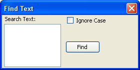
Here, two vertical boxes are created, one for the textbox and the other for the check box and button. The left box has a flexiblity that is 3 times greater than the right one so it will always receive 3 times as much of the extra space when the window size is increased. The right box enforces a minimum width of 150 pixels.
The textbox is flexible so it will resize as the window resizes. The textbox also enforces a minimum width of 100 pixels. The check box appears in the right box along with its label. Just below the check box is a spacer. The spacer will grow and shrink but not exceed 30 pixels. The result is that the check box and the Find button will be spaced apart from each other by some space of no more than 30 pixels.
The second box has an alignment of start. This causes the child elements to be aligned on the left edge. If this was not specified, the default would be stretch, which would make the child elements stretch horizontally. Because we don't want the Find button to change size, we need to set an alignment.
Next, we will learn about a more specialized type of box, the groupbox.