
Here we'll look at controlling the position and size of an element.
Box Element Positioning
So far, we know how to position elements either horizontally or vertically inside a box. We will often need more control over the position and size of elements within the box. For this, we first need to look at how a box works.
The position of an element is determined by the layout style of its container. For example, the position of a button in a horizontal box is to the right of the previous button, if any. The size of an element is determined by two factors, the size that the element wants to be and the size you specify. The size that an element wants to be is determined by what is in the element. For example, a button's width is determined by the amount of text inside the button.
An element will generally be as large as it needs to be to hold its contents, and no larger. Some elements, such as textboxes have a default size, which will be used. A box will be large enough to hold the elements inside the box. A horizontal box with three buttons in it will be as wide as the three buttons, plus a small amount of padding.
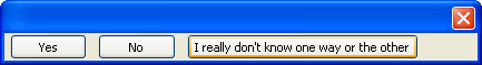
In the image, the first two buttons have been given a suitable size to hold their text. The third button is larger because it contains more content. The width of the box containing the buttons is the total width of the buttons plus the padding between them. The height of the buttons is a suitable size to hold the text.
Width and height attributes
You may need to have more control over the size of an element in a window. There are a number of features that allow you to control the size of an element. The quick way is to simply add the widthheightimg tag. An example is shown below:
<button label="OK" width="100" height="40"/>
However, it is not recommended that you do this. It is not very portable and may not fit in with some themes. A better way is to use style properties, which work similarly to style sheets in HTML. The following CSS properties can be used.
width- This specifies the width of the element. Note that the CSS global skin of the XUL application may also specify a
min-widthfor the buttons and other elements, thus if simply setting thewidthproperty does not set the button width as you expect, try also to modify the buttonmin-widthproperty. height- This specifies the height of the element.
By setting either of the two properties, the element will be created with that width and height. If you specify only one size property, the other is calculated as needed. The size of these style properties should be specified as a number followed by a unit.
Flexible elements
The sizes are fairly easy to calculate for non-flexible elements. They simply obey their specified widths and heights, and if the size wasn't specified, the element's default size is just large enough to fit the contents. For flexible elements, the calculation is slightly trickier.
Flexible elements are those that have a flex
<window orient="horizontal"
        xmlns="http://www.mozilla.org/keymaster/gatekeeper/there.is.only.xul">

<hbox>
  <button label="Yes" flex="1"/>
  <button label="No"/>
  <button label="I really don't know one way or the other"/>
</hbox>

</window>
The window will initially appear like in the image earlier. The first two buttons will be sized at a suitable default width and the third button will be larger because it has a longer label. The first button is made flexible and all three elements have been placed inside a box. The width of the box will be set to the initial total width of all three buttons (around 430 pixels in the image).
If you increase the width of the window, elements are checked to see whether they are flexible to fill the blank space that would appear. The first button is the only flexible element, but it will not grow wider. This is because the box that the button is inside is not flexible. An inflexible element never changes size even when space is available, so the button can't grow either. Thus, the button won't get wider.
The solution is to make the box flexible also. Then, when you make the window wider, extra space will be available, so the box will grow to fill the extra space. Because the box is larger, more extra space will be created inside it, and the flexible button inside it will grow to fit the available space. This process repeats for as many nested boxes as necessary.
Setting Minimum and Maximum Sizes
You may want to allow an element to be flexible but constrain the size so that it cannot be larger than a certain size. Or, you may want to set a minimum size. You can set this by using four attributes:
minwidth;- This specifies the minimum width that the element can be.
minheight- This specifies the minimum height that the element can be.
maxwidth- This specifies the maximum width that the element can be.
maxheight- This specifies the maximum height that the element can be.
The values are always measured in pixels. You can also use the corresponding CSS properties, min-width, min-height, max-width and max-height.
These properties are only useful for flexible elements. By setting a maximum height, for example, a stretchy button will only grow to a certain maximum height. You will still be able to resize the window beyond that point but the button will stop growing in size. The box the button is inside will also continue to grow, unless you set a maximum height on the box also.
If two buttons are equally flexible, normally both will share the amount of extra space. If one button has a maximum width, the second will still continue to grow and take all of the remaining space.
If a box has a maximum width or height, the children cannot grow larger than that maximum size. If a box has a minimum width or height, the children cannot shrink smaller than that minimum size.
Examples of setting widths and heights
<button label="1" style="width: 100px;"/>
<button label="2" style="width: 100em; height: 10px;"/>
<button label="3" flex="1" style="min-width: 50px;"/>
<button label="4" flex="1" style="min-height: 2ex; max-width: 100px"/>
<textbox flex="1" style="max-width: 10em;"/>
<description style="max-width: 50px">This is some boring but simple
wrapping text.</description>
- Example 1
- The first button will be displayed with a width of 100 pixels (px means pixels). You need to add the unit or the width will be ignored.
- Example 2
- The second button will be displayed with a height of ten pixels and a width of 100 ems (an em is the size of a character in the current font).
- Example 3
- The third button is flexible so it will grow based on the size of the box the button is in. However, the button will never shrink to be less than 50 pixels. Other flexible components such as spacers will absorb the remaining space, breaking the flex ratio.
- Example 4
- The fourth button is flexible and will never have a height that is smaller than 2 ex (an ex is usually the height of the letter x in the current font) or wider than 100 pixels.
- Example 5
- The text input is flexible but will never grow to be larger than 10 ems. You will often want to use ems when specifying sizes with text in them. This unit is useful for textboxes so that the font can change and the textboxes would always be a suitable size, even if the font is very large.
- Example 6
- The
description
Our find files dialog
Let's add some of these styles to the find files dialog. We'll make it so that the textbox will resize to fit the entire window.
<textbox id="find-text" flex="1" style="min-width: 15em;"/>
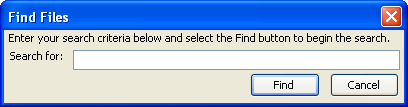
Here, the text input has been made flexible. This way, it will grow if the user changes the size of the dialog. This is useful if the user wants to enter a long string of text. Also, a minimum width of 15 ems has been set so that the text box will always show at least 15 characters. If the user resizes the dialog to be very small, the text input will not shrink past 15 ems. It will be drawn as if it extends past the edge of the window. Notice in the image that the text input has grown to extend to the full size of the window.
Box Packing
Let's say you have a box with two child elements, both of which are not flexible, but the box is flexible. For example:
<box flex="1">
  <button label="Happy"/>
  <button label="Sad"/>
</box>
If you resize the window, the box will stretch to fit the window size. The buttons are not flexible, so they will not change their widths. The result is extra space that will appear on the right side of the window, inside the box. You may wish, however, for the extra space to appear on the left side instead, so that the buttons stay right aligned in the window.
You could accomplish this by placing a spacerpackboxpack
- start
- This positions elements at the left edge for horizontal boxes and at the top edge for vertical boxes. This is the default value.
- center
- This centers the child elements in the box.
- end
- This positions elements at the right edge for horizontal boxes and at the bottom edge for vertical boxes.
The pack
We can change the earlier example to center the elements as follows:
<box flex="1" pack="center">
  <button label="Happy"/>
  <button label="Sad"/>
</box>
Now, when the window is resized, the buttons center themselves horizontally. Compare this behavior to that of the previous example.
Box Alignment
If you resize the window in the Happy-Sad example above horizontally, the box will grow in width. If you resize the window vertically however, you will note that the buttons grow in height. This is because the flexibility is assumed by default in the other direction.
You can control this behavior with the alignpack
- start
- This aligns elements along the top edge for horizontal boxes and along the left edge for vertical boxes.
- center
- This centers the child elements in the box.
- end
- This aligns elements along the bottom edge for horizontal boxes and along the right edge for vertical boxes.
- baseline
- This aligns the elements so that the text lines up. This is only useful for horizontal boxes.
- stretch
- This value, the default, causes the elements to grow to fit the size of the box, much like a flexible element, but in the opposite direction.
As with the packalign
For example, the first box below will have its children stretch, because that is the default. The second box has an align
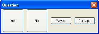
<?xml version="1.0"?>
<?xml-stylesheet href="chrome://global/skin/" type="text/css"?>

<window id="yesno" title="Question" orient="horizontal"
        xmlns="http://www.mozilla.org/keymaster/gatekeeper/there.is.only.xul">

  <hbox>
    <button label="Yes"/>
    <button label="No"/>
  </hbox>
  <hbox align="center">
    <button label="Maybe"/>
    <button label="Perhaps"/>
  </hbox>

</window>
You can also use the style properties -moz-box-pack and -moz-box-align instead of specifying attributes.
Cropping Text and Buttons
You could potentially create a button element that contains a label that is larger than the maximum width of the button. Of course, a solution would be to increase the size of the button. However, buttons (and other elements with a label) have a special attribute called crop that allows you to specify how the text may be cropped if it is too big.
If the text is cropped, an ellipsis (...) will appear on the button where the text was taken out. Four possible values are valid:
- left
- The text is cropped on its left side
- right
- The text is cropped on its right side
- center
- The text is cropped in the middle.
- none
- The text is not cropped. This is the default value.
This attribute is really only useful when a dialog has been designed to be useful at any size. The crop attribute can also be used with other elements that use the label attribute for labels. The following shows this attribute in use:
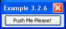
<button label="Push Me Please!" crop="right" flex="1"/>
Notice how the text on the button has had the right side of it cropped after the window is made smaller.
Next, a summary and some additional details of the box model are described.