
XUL has elements that are similar to the HTML form controls.
Looking for a guide to using input controls and forms on the Web? See Forms in HTML.
Text Entry Fields
HTML has an input element which can be used for text entry controls. XUL has a similar element, textboxtextbox element creates a box in which the user can enter text. Textboxes accept many of the same attributes as HTML input controls. The following are some of them:
id- A unique identifier so that you can identify the textbox.
class- The style class of the textbox.
value- If you want the textbox to have default text, supply it with the value attribute.
disabled- Set to
trueto have text entry disabled. textbox.type- You can set this attribute to the special value
passwordto create a textbox that hides what it types. This is usually used for password entry fields. maxlength- The maximum number of characters that the textbox allows.
Note that while in HTML, several different kinds of fields can be created with the input element, in XUL there are separate elements for each type.
The following example shows some textboxes:
<label control="some-text" value="Enter some text"/>
<textbox id="some-text"/>
<label control="some-password" value="Enter a password"/>
<textbox id="some-password" type="password" maxlength="8"/>
Multiline textbox
The textboxtextarea element for creating a larger text entry area. In XUL, you can use the textbox element for this purpose as well -- two separate elements are not necessary. If you set the multiline
<textbox multiline="true"
         value="This is some text that could wrap onto multiple lines."/>
Like the HTML textarea, you can use the rows and cols attributes to set the size. This should be set to the number of rows and columns of characters to display.
Our find files example
Let's add a search entry field to the find file dialog. We'll use the textbox element.
<label value="Search for:" control="find-text"/>
<textbox id="find-text"/>

<button id="find-button" label="Find"/>
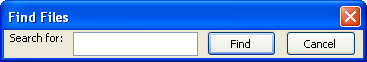
Add these lines before the buttons we created in the last section. If you open this window, you will see something much like that shown in the image.
Notice that the label and the text input field have now appeared in the window. The textbox is fully functional and you can type into it and select text. Note that the controllabel
Checkboxes and Radio Buttons
Two additional elements are used for creating check boxes and radio buttons. They are variations of buttons. The checkbox element is used for options that can be enabled or disabled. Radio buttons can be used for a similar purpose when there are a set of them and only one can be selected at once.
You can use most of the same attributes on checkboxes and radio buttons as with buttons. The example below shows some simple checkboxes and radio buttons.
<checkbox id="case-sensitive" checked="true" label="Case sensitive"/>
<radio id="orange" label="Orange"/>
<radio id="violet" selected="true" label="Violet"/>
<radio id="yellow" label="Yellow"/>
The first line creates a simple checkboxcheckedtrue or false. The labelradioselectedcheckedtrue to have a radio button selected by default, or leave it out for other radio buttons.
Radiogroup element
In order to group radio buttons together, you need to use the radiogroup
<radiogroup>
  <radio id="orange" label="Orange"/>
  <radio id="violet" selected="true" label="Violet"/>
  <radio id="yellow" label="Yellow"/>
</radiogroup>
Attributes
Like buttons, check boxes and radio buttons are made up of a label and an image, where the image switches between checked and unchecked when it is pressed. Check boxes have many of the same attributes as buttons:
label- The label on the check box or radio button.
disabled- Set this to either
trueorfalseto disable or enable the check box or radio button. accesskey- The shortcut key that can be used to select the element. The letter specified is usually drawn underlined in the label.
- to view XUL, you need e.g. seamonkey or waterfox and remote-xul-manager from https://github.com/jvillalobos/Remote-XUL-Manager
In the next section, we will look at some elements for entering and selecting numbers.
Looking for a guide to using input controls and forms on the Web? See Forms in HTML.