
An element that can be turned on and off. This is most commonly rendered as a box when the element is off and a box with a check when the element is on. The user can switch the state of the check box by selecting it with the mouse. A label, specified with the label attribute, may be added beside the check box.
More information is available in the XUL tutorial.
Examples
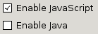
<checkbox label="Enable JavaScript" checked="true"/>
<checkbox label="Enable Java" checked="false"/>
Attributes
checked- Type: boolean
- Indicates whether the element is checked or not.
- Use
hasAttribute()to determine whether this attribute is set instead ofgetAttribute(). - For buttons, the
typeattribute must be set tocheckboxorradiofor this attribute to have any effect.
-
crop - Type: one of the values below
-
If the label of the element is too big to fit in its given space, the text will be cropped on the side specified by the
cropattribute. An ellipsis will be used in place of the cropped text. If the box direction is reversed, the cropping is reversed. -
-
start - The text will be cropped on its left side in left-to-right text locales, and the right side in right-to-left locales.
-
end - The text will be cropped on its right side in left-to-right text locales, and the right side in right-to-left locales.
-
left - The text will be cropped on its left side.
-
right - The text will be cropped on its right side.
-
center - The text will be cropped in the middle, showing both the start and end of the text normally.
-
none - The text will be not be cropped using an ellipsis. However, the text will simply be cut off if it is too large. The side depends on the CSS text alignment.
-
-
Depending on the platform and theme being used, some elements will have set a maximum width so they will always appear cropped. If you wish to use the value
noneand the displayed text is larger than this maximum width, you may be able to use the max-width CSS property (or the maxwidth attribute) to override this size. For example, for a menuitem in a menu you can add the following CSS rule when you want to use the valuenone: -
menupopup > menuitem, menupopup > menu { max-width: none; }
disabled- Type: boolean
- Indicates whether the element is disabled or not. If this attribute is set, the element is disabled. Disabled elements are usually drawn with grayed-out text. If the element is disabled, it does not respond to user actions, it cannot be focused, and the
commandevent will not fire. In the case of form elements, it will not be submitted. Do not set the attribute totrue, as this will suggest you can set it tofalseto enable the element again, which is not the case.Thedisabledattribute is allowed only for form controls. Using it with an anchor tag (an<a>link) will have no effect.The element will, however, still respond to mouse events. To enable the element, leave this attribute out entirely. - Visible controls have a
disabledproperty which, except for menus and menuitems, is normally preferred to use of the attribute, as it may need to update additional state.
src- Type: URI
- Set this to an URI pointing to an image to appear in the checkbox. If this attribute is left out, no image appears. You can have both an image and a label.
preference- Type: id
- Connects the element to a corresponding
preference. This attribute only has any effect when used inside aprefwindow. More information is available in the Preferences System article.
tabindex- Type: integer
- The tab order of the element. The tab order is the order in which the focus is moved when the user presses the "
tab" key. Elements with a highertabindexare later in the tab sequence.
Properties
-
accessibleType - Type: integer
- A value indicating the type of accessibility object for the element.
Methods
Related
- Interfaces
nsIAccessibleProvider,nsIDOMXULCheckboxElement