
This element is used to create a list of items where one or more of the items may be selected. A listbox may contain multiple columns. There are numerous methods which allow the items in the listbox to be retrieved and modified.
You may specify the number of rows to display in the list using the rows attribute. Additional rows can be viewed using a scroll bar. A listbox is expected to contain listitem elements. All the rows in the listbox are the same height, which is the height of the tallest item in the list. If you wish to create a list with variable height rows, or with non-text content, you should instead use the richlistbox element.
See List Controls for more information.
- Attributes
- disabled, disableKeyNavigation, preference, rows, seltype, suppressonselect, tabindex, value
- Properties
- accessibleType, currentIndex, currentItem, disabled, disableKeyNavigation, itemCount, listBoxObject, selectedCount, selectedIndex, selectedItem, selectedItems, selType, suppressOnSelect, tabIndex, value
- Methods
- addItemToSelection, appendItem, clearSelection, ensureElementIsVisible, ensureIndexIsVisible, getIndexOfFirstVisibleRow, getIndexOfItem, getItemAtIndex, getNumberOfVisibleRows, getRowCount, getSelectedItem, insertItemAt, invertSelection, moveByOffset, removeItemAt, removeItemFromSelection, scrollToIndex, selectAll, selectItem, selectItemRange, timedSelect, toggleItemSelection
Examples
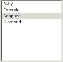
<listbox id="theList">
  <listitem label="Ruby"/>
  <listitem label="Emerald"/>
  <listitem label="Sapphire" selected="true"/>
  <listitem label="Diamond"/>
</listbox>
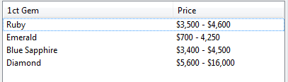
<listbox id="theList" rows="10" width="400">
  <listhead>
    <listheader label="1ct Gem" width="240"/>
    <listheader label="Price" width="150"/>
  </listhead>
  <listcols>
    <listcol/>
    <listcol flex="1"/>
  </listcols>
</listbox>
var theList = document.getElementById('theList');
    gems = [  {gem: "Ruby", Price: "$3,500 - $4,600"},
           {gem: "Emerald", Price: "$700 - 4,250"},
           {gem: "Blue Sapphire", Price: "$3,400 - $4,500"},
           {gem: "Diamond", Price: "$5,600 - $16,000"}  ];

for (var i = 0; i < gems.length; i++) {
    var row = document.createElement('listitem');
    var cell = document.createElement('listcell');
    cell.setAttribute('label', gems[i].gem);
    row.appendChild(cell);

    cell = document.createElement('listcell');
    cell.setAttribute('label',  gems[i].Price );
    row.appendChild(cell);

    theList.appendChild(row);
}
Attributes
disabled- Type: boolean
- Indicates whether the element is disabled or not. If this attribute is set, the element is disabled. Disabled elements are usually drawn with grayed-out text. If the element is disabled, it does not respond to user actions, it cannot be focused, and the
commandevent will not fire. In the case of form elements, it will not be submitted. Do not set the attribute totrue, as this will suggest you can set it tofalseto enable the element again, which is not the case.Thedisabledattribute is allowed only for form controls. Using it with an anchor tag (an<a>link) will have no effect.The element will, however, still respond to mouse events. To enable the element, leave this attribute out entirely. - Visible controls have a
disabledproperty which, except for menus and menuitems, is normally preferred to use of the attribute, as it may need to update additional state.
preference- Type: id
- Connects the element to a corresponding
preference. This attribute only has any effect when used inside aprefwindow. More information is available in the Preferences System article.
-
rows - Type: integer
-
The number of rows to display in the element. If the element contains more than this number of rows, a scrollbar will appear which the user can use to scroll to the other rows. To get the actual number of rows in the element, use the
getRowCountmethod.
seltype- Type: one of the values below
- Used to indicate whether multiple selection is allowed.
-
single- Only one row may be selected at a time. (Default in
listboxandrichlistbox.) multiple- Multiple rows may be selected at once. (Default in
tree.)
-
For trees, you can also use the following values:
cell- Individual cells can be selected
text- Rows are selected; however, the selection highlight appears only over the text of the primary column.
For
richlistbox, this is new in Firefox 3.5.
suppressonselect- Type: boolean
- If this attribute is not specified, a select event is fired whenever an item is selected, either by the user or by calling one of the select methods. If set to
true, the select event is never fired.
tabindex- Type: integer
- The tab order of the element. The tab order is the order in which the focus is moved when the user presses the "
tab" key. Elements with a highertabindexare later in the tab sequence.
value- Type: string
- The string attribute allows you to associate a data value with an element. It is not used for any specific purpose, but you can access it with a script for your own use. Be aware, however, that some elements, such as textbox will display the value visually, so in order to merely associate data with an element, you could 1) Use another attribute like "value2" or "data-myAtt" (as in the HTML5 draft), as XUL does not require validation (less future-proof); 2) Use setAttributeNS() to put custom attributes in a non-XUL namespace (serializable and future-proof); 3) Use setUserData() (future-proof and clean, but not easily serializable). For user editable
menulistelements, the contents, as visible to the user, are read and set using the Menulist.value syntax. For those elements, setAttribute("value", myValue) and getAttribute("value") do not access or affect the contents displayed to the user.
Properties
-
accessibleType - Type: integer
- A value indicating the type of accessibility object for the element.
currentIndex- Type: integer
- Set to the index of the currently focused item in the list. If no item is focused, the value will be
-1. (or, on some platforms,typeof(listboxcurrentIndex)will beundefined) In a single selection list, the current index will always be the same as the selected index. In a multiple selection list, the currently focused row may be modified by the user without changing the selection by pressing the Control key and pressing the cursor keys to navigate.
currentItem- Type: listitem element
- Returns the currently focused item in the list box, which is only useful in a multiple selection list box.
itemCount- Type: integer
- Read only property holding the number of child items.
-
listBoxObject -
Type:
nsIListBoxObject -
The
nsIListBoxObjectbehind the list box. This property is read-only. Most of the features of the list box are already available directly in thelistbox, so you will rarely have need to use this box object directly.
selectedCount- Type: integer
- Returns the number of items that are currently selected.
-
selectedIndex - Type: integer
-
Returns the index of the currently selected item. You may select an item by assigning its index to this property. By assigning
-1to this property, all items will be deselected. Returns -1 if no items are selected
-
selectedItem - Type: element
-
Holds the currently selected item. If no item is currently selected, this value will be
null. You can select an item by setting this value. A select event will be sent to the controlling container (i.e. the listbox, richlistbox, radiogroup, etc., not the list item that was selected) when it is changed either via this property, theselectedIndexproperty, or changed by the user.
selectedItems- Type: array of listitems
- Returns an array of the selected items in the list.
suppressOnSelect- Type: boolean
- Gets and sets the value of the
suppressonselectattribute.
-
value - Type: string
-
Gets and sets the value of the
valueattribute. Fortextboxand user editablemenulistelements, the contents, as visible to the user, are read and set using theTextbox.valueand Menulist.value syntax.
Methods
addItemToSelection( item )- Return type: no return value
- Selects the given item, without deselecting any other items that are already selected.
-
appendItem( label, value ) - Return type: element
- Creates a new item and adds it to the end of the existing list of items. You may optionally set a value. The function returns the newly created element.
clearSelection()- Return type: no return value
- Deselects all of the items. A select event is sent before the items are deselected.
ensureElementIsVisible( element )- Return type: no return value
- If the specified element is not currently visible to the user, the displayed items are scrolled so that it is. If the item is already visible, no scrolling occurs.
ensureIndexIsVisible( index )- Return type: no return value
- If the item at the specified index is not currently visible to the user the displayed items are scrolled so that it is. If the item is already visible, no scrolling occurs.
getIndexOfFirstVisibleRow()- Return type: integer
- Returns the index of the first displayed row. Note that this is not the same as the first row -- if the displayed items have been scrolled down, this function will retrieve the index of the first row that the user can see.
getIndexOfItem( item )- Return type: integer
- Returns the zero-based position of the specified item. Items are numbered starting at the first item displayed in the list.
getItemAtIndex( index )- Return type: element
- Returns the element that is at the specified index.
getNumberOfVisibleRows()- Return type: integer
- Returns the number of rows that are currently visible to the user.
-
getRowCount() - Return type: integer
- Returns the total number of rows in the element, regardless of how many rows are displayed.
getSelectedItem( index )- Return type: element
- When multiple items are selected, you can retrieve each selected item using this method. The argument index specifies the index in the list of the selected items, not the row number of the item. The item index is zero-based, thus this example will return the first selected item:
getSelectedItem(0).
-
insertItemAt( index, label, value ) - Return type: element
- This method creates a new item and inserts it at the specified position. You may optionally set a value. The new item element is returned.
invertSelection()- Return type: no return value
- Reverses the selected state of all items. Selected items become deselected, and deselected items become selected.
moveByOffset( offset , isSelecting, isSelectingRange)- Return type: no return value
- If
offsetis positive, adjusts the focused item forward by that many items. Ifoffsetis negative, adjusts the focused item backward by that many items. IfisSelectingistrue, then the selection is also adjusted. IfisSelectingRangeis alsotrue, then the new item is selected in addition to any currently selected items. IfisSelectingRangeisfalse, any existing selection is cleared. Items that are hidden are skipped.
-
removeItemAt( index ) - Return type: element
- Removes the child item in the element at the specified index. The method returns the removed item.
removeItemFromSelection( item )- Return type: no return value
- Deselects the specified item without deselecting other items.
scrollToIndex( index )- Return type: no return value
- Scrolls the element to the specified index. This is different than
ensureIndexIsVisiblebecause the view is always scrolled.
-
selectAll() - Return type: no return value
- Selects all of the items. A select event is sent after the selection is made.
-
selectItem( item ) - Return type: no return value
- Deselects all of the currently selected items and selects the given item. A select event is sent after the selection is made.
-
selectItemRange( startItem, endItem ) - Return type: no return value
- Selects the items between the two items given as arguments, including the start and end items. All other items are deselected. This method does nothing for single-selection list boxes. A select event is sent after the selection is made.
-
timedSelect( item, timeout ) - Return type: no return value
- Selects the item specified by the argument item after the number of milliseconds given by the timeout argument. All other items are deselected.
-
toggleItemSelection( item ) - Return type: no return value
- If the specified item is selected, it is deselected. If it is not selected, it is selected. Other items in the list box that are selected are not affected, and retain their selected state.