
You will often need to create a layout which has a number of columns, and CSS provides several ways to do this. Whether you use Grid, Flexbox or Multi-column layout will depend on what you are trying to achieve, and in this recipe we explore these options.
Requirements
There are a number of design patterns you might want to achieve with your columns:
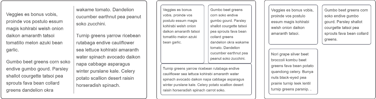
- A continuous thread of content broken up into newspaper-style columns.
- A single row of items arranged as columns, with all heights being equal.
- Multiple rows of columns lined up by row and column.
The recipes
You need to choose different layout methods in order to achieve your requirements.
A continuous thread of content — multi-column layout
If you create columns using multi-column layout your text will remain as a continuous stream filling each column in turn. The columns must all be the same size, and you are unable to target an individual column or the content of an individual column.
You can control the gaps between columns with the column-gap property, and add a rule between columns using column-rule.
Use multicol when:
- You want your text to display in newspaper-like columns.
- You have a set of small items you want to break into columns.
- You do not need to target individual column boxes for styling.
A single row of items with equal heights — flexbox
Flexbox can be used to break content into columns by setting flex-direction to row, however flexbox targets the elements inside the flex container and will place each direct child into a new column. This is a different behavior to what you saw with multicol.
There is currently no way to add a rule between flex items, and browser support for the column-gap and row-gap properties is limited. Therefore to create gaps between items use a margin.
Flexbox can also be used to create layouts where the flex items wrap onto new rows, by setting the flex-wrap property on the container to wrap. These new flex lines will distribute space along that line only — the items in the new line will not line up with items in the line above, as you'll see in the example below. This is why flexbox is described as one-dimensional. It is designed for controlling layout as a row or a column, but not both at the same time.
Use flexbox:
- For single rows or columns of items.
- When you want to do alignment on the cross axis after laying out your items.
- When you are happy for wrapped items to share out space along their line only and not line up with items in other lines.
Lining items up in rows and columns — grid layout
If what you want is a layout where items line up in rows and columns then you should choose CSS Grid Layout. Grid Layout works on the direct children of the grid container in a similar way to the manner in which flexbox works on the direct children of the flex container, however with CSS Grid you can line your items up in rows and columns — it is described as two-dimensional.
Use Grid:
- For multiple rows or columns of items.
- When you want to be able to align the items on the block and inline axes.
- When you want items to line up in rows and columns.
Browser compatibility
The various layout methods have different browser support. See the charts below for details on basic support for the properties used.
column-width
| Desktop | Mobile | |||||||||||
|---|---|---|---|---|---|---|---|---|---|---|---|---|
column-width | Chrome
Full support
50
| Edge
Full support
12
| Firefox
Full support
50
| IE Full support 10 | Opera
Full support
11.1
| Safari
Full support
9
| WebView Android
Full support
50
| Chrome Android
Full support
50
| Firefox Android
Full support
50
| Opera Android
Full support
11.1
| Safari iOS
Full support
9
| Samsung Internet Android
Full support
5.0
|
| Intrinsic sizes | Chrome No support No | Edge No support No | Firefox No support No | IE No support No | Opera No support No | Safari No support No | WebView Android No support No | Chrome Android No support No | Firefox Android No support No | Opera Android No support No | Safari iOS No support No | Samsung Internet Android No support No |
Legend
- Full support
- Full support
- No support
- No support
- Experimental. Expect behavior to change in the future.
- Experimental. Expect behavior to change in the future.
- See implementation notes.
- See implementation notes.
- Requires a vendor prefix or different name for use.
- Requires a vendor prefix or different name for use.
column-rule
| Desktop | Mobile | |||||||||||
|---|---|---|---|---|---|---|---|---|---|---|---|---|
column-rule | Chrome
Full support
50
| Edge
Full support
12
| Firefox
Full support
52
| IE Full support 10 | Opera
Full support
11.1
| Safari
Full support
9
| WebView Android
Full support
50
| Chrome Android
Full support
50
| Firefox Android
Full support
52
| Opera Android
Full support
11.1
| Safari iOS
Full support
9
| Samsung Internet Android
Full support
5.0
|
Legend
- Full support
- Full support
- See implementation notes.
- See implementation notes.
- Requires a vendor prefix or different name for use.
- Requires a vendor prefix or different name for use.
flex
| Desktop | Mobile | |||||||||||
|---|---|---|---|---|---|---|---|---|---|---|---|---|
flex | Chrome
Full support
29
| Edge
Full support
12
| Firefox
Full support
20
| IE
Full support
11
| Opera Full support 12.1 | Safari
Full support
9
| WebView Android
Full support
4.4
| Chrome Android
Full support
29
| Firefox Android
Full support
20
| Opera Android Full support 12.1 | Safari iOS
Full support
9
| Samsung Internet Android
Full support
2.0
|
Legend
- Full support
- Full support
- See implementation notes.
- See implementation notes.
- User must explicitly enable this feature.
- User must explicitly enable this feature.
- Requires a vendor prefix or different name for use.
- Requires a vendor prefix or different name for use.
flex-wrap
| Desktop | Mobile | |||||||||||
|---|---|---|---|---|---|---|---|---|---|---|---|---|
flex-wrap | Chrome
Full support
29
| Edge Full support 12 | Firefox Full support 28 | IE
Partial support
11
| Opera Full support 17 | Safari
Full support
9
| WebView Android
Full support
4.4
| Chrome Android
Full support
29
| Firefox Android Full support 52 | Opera Android Full support 18 | Safari iOS
Full support
9
| Samsung Internet Android
Full support
2.0
|
Legend
- Full support
- Full support
- Partial support
- Partial support
- See implementation notes.
- See implementation notes.
- Requires a vendor prefix or different name for use.
- Requires a vendor prefix or different name for use.
grid-template-columns
| Desktop | Mobile | |||||||||||
|---|---|---|---|---|---|---|---|---|---|---|---|---|
grid-template-columns | Chrome
Full support
57
| Edge Full support 16 | Firefox
Full support
52
| IE No support No | Opera
Full support
44
| Safari Full support 10.1 | WebView Android Full support 57 | Chrome Android
Full support
57
| Firefox Android
Full support
52
| Opera Android
Full support
43
| Safari iOS Full support 10.3 | Samsung Internet Android Full support 6.0 |
| Animation of tracks | Chrome No support No | Edge No support No | Firefox Full support 66 | IE No support No | Opera No support No | Safari No support No | WebView Android No support No | Chrome Android No support No | Firefox Android Full support 66 | Opera Android No support No | Safari iOS No support No | Samsung Internet Android No support No |
fit-content() | Chrome Full support 29 | Edge Full support 16 | Firefox Full support 51 | IE No support No | Opera Full support 44 | Safari Full support 10.1 | WebView Android Full support 57 | Chrome Android Full support 57 | Firefox Android Full support 51 | Opera Android Full support 43 | Safari iOS Full support 10.3 | Samsung Internet Android Full support 6.0 |
minmax() | Chrome
Full support
57
| Edge Full support 16 | Firefox
Full support
52
| IE No support No | Opera
Full support
44
| Safari Full support 10.1 | WebView Android Full support 57 | Chrome Android
Full support
57
| Firefox Android
Full support
52
| Opera Android
Full support
43
| Safari iOS Full support 10.3 | Samsung Internet Android Full support 6.0 |
repeat() | Chrome
Full support
57
| Edge Full support 16 | Firefox
Partial support
57
| IE No support No | Opera
Full support
44
| Safari Full support 10.1 | WebView Android Full support 57 | Chrome Android
Full support
57
| Firefox Android
Full support
52
| Opera Android
Full support
43
| Safari iOS Full support 10.3 | Samsung Internet Android Full support 6.0 |
subgrid | Chrome No support No | Edge No support No | Firefox
Full support
71
| IE No support No | Opera No support No | Safari No support No | WebView Android No support No | Chrome Android No support No | Firefox Android No support No | Opera Android No support No | Safari iOS No support No | Samsung Internet Android No support No |
Legend
- Full support
- Full support
- Partial support
- Partial support
- No support
- No support
- See implementation notes.
- See implementation notes.
- User must explicitly enable this feature.
- User must explicitly enable this feature.