
The translateX() CSS function repositions an element horizontally on the 2D plane. Its result is a <transform-function> data type.
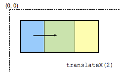
Note: translateX(tx) is equivalent to translate(tx, 0) or translate3d(tx, 0, 0).
Syntax
/* <length-percentage> values */
transform: translateX(200px);
transform: translateX(50%);
Values
<length-percentage>- Is a
<length>or<percentage>representing the abscissa of the translating vector. A percentage value refers to the width of the reference box defined by thetransform-boxproperty.
| Cartesian coordinates on ℝ2 | Homogeneous coordinates on ℝℙ2 | Cartesian coordinates on ℝ3 | Homogeneous coordinates on ℝℙ3 |
|---|---|---|---|
|
A translation is not a linear transformation in ℝ2 and can't be represented using a Cartesian-coordinate matrix. |
|||
[1 0 0 1 t 0] |
Formal syntax
translateX(<length-percentage>)
Examples
HTML
<div>Static</div>
<div class="moved">Moved</div>
<div>Static</div>
CSS
div {
  width: 60px;
  height: 60px;
  background-color: skyblue;
}

.moved {
  transform: translateX(10px); /* Equal to translate(10px) */
  background-color: pink;
}
Result
Specifications
| Specification | Status | Comment |
|---|---|---|
| CSS Transforms Level 1 The definition of 'translateX()' in that specification. |
Working Draft | Initial definition |
Browser compatibility
Please see the <transform-function> data type for compatibility info.