
It is common in preference dialogs for tabbed pages to appear. We'll find out how to create them here.
Tabboxes
Tabboxes are typically used in an application in the preferences window. A series of tabs appears across the top of a window. The user can click each tab to see a different set of options. It is useful in cases when you have more options than will fit in one screen.
XUL provides a method to create such dialogs. It involves five new elements, which are described briefly here and in more detail below.
tabbox- The outer box that contains the tabs along the top and the tab pages themselves.
tabs- The inner box that contains the individual tabs. In other words, this is the row of tabs.
tab- A specific tab. Clicking on the tab brings the tab page to the front.
tabpanels- The container for the pages.
tabpanel- The body of a single page. You would place the content for a page within this element. The first tabpanel corresponds to the first tab, the second tabpanel corresponds to the second tab and so on.
The tabboxtabstabpanels
Shown below is the general syntax of a tabbox:
<tabbox id="tablist">
  <tabs>
    <!-- tab elements go here -->
  </tabs>
  <tabpanels>
    <!-- tabpanel elements go here -->
  </tabpanels>
</tabbox>
The tabtabstabstabboxtabbox also contains a tabpanels element which will appear below the tabs due to the vertical orientation on the whole tabbox.
There is really nothing special about the tab elements that make them different than boxes. Like boxes, tabs can contain any element. The difference is that the tabs render slightly differently and only one tab panel's contents are visible at once, much like a deck
The contents of the individual tab pages should go inside each tabpaneltab
Each tabpaneltabtabpanel
When determining the size of the tabbox
Tabbox example
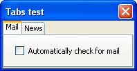
<tabbox>
  <tabs>
    <tab label="Mail"/>
    <tab label="News"/>
  </tabs>
  <tabpanels>
    <tabpanel id="mailtab">
      <checkbox label="Automatically check for mail"/>
    </tabpanel>
    <tabpanel id="newstab">
      <button label="Clear News Buffer"/>
    </tabpanel>
  </tabpanels>
</tabbox>
Here, two tabs have been added, the first labeled 'Mail' and the other 'News'. When the user clicks on the Mail tab, the contents of the first tab page will be displayed below the tabs. In this case, the page with the check box labeled 'Automatically check for mail' will appear. When the second tab is clicked, the page containing the button labeled 'Clear News Buffer' will appear instead.
The currently selected tab element is given an additional selected attribute which is set to true. This alters the appearance of the currently selected tab to make it look selected. Only one tab will have a true value for this attribute at a time.
Position of the tabs
Finally, you can change the position of the tabs so that they appear on any side of the tab pages. There is no special syntax to do this. You simply set the orient and dir attributes as necessary. Remember that the tab elements are much like regular boxes in terms of layout. Moreover, the tabboxtabs
For example, to place the tabs along the left side, change the orientation of the tabstabbox so it has horizontal orientation. This will make the tabs appear to the left of, not above, the tab pages. Note that changing the orientation of the tabpanels
You can place the tabs on the right or bottom side by moving the tabs element to after the tabpanels element in your code. Alternatively, you could set the dir attribute to reverse on the tabbox. However, you should probably leave the tabs on top, otherwise they might not look very good under particular themes.
Adding Tabs to our Find Files Dialog
Let's add a second panel to the find files dialog. We'll create an Options tab (and select it by default) that will contain some options for searching. This may not be the best interface for doing this, but we'll use it to demonstrate tabs. The label across the top and the search criteria box will need to go on the first tab. We'll add some options on the second tab. The progress bar and the buttons can stay on the main dialog, outside of the tabs.
<vbox flex="1">

<tabbox selectedIndex="1">
  <tabs>
    <tab label="Search"/>
    <tab label="Options"/>
  </tabs>

  <tabpanels>
   <tabpanel id="searchpanel" orient="vertical">

    <description>
     Enter your search criteria below and select the Find button to begin
     the search.
    </description>

    <spacer style="height: 10px"/>

    <groupbox orient="horizontal">
      <caption label="Search Criteria"/>

      <menulist id="searchtype">
        <menupopup>
          <menuitem label="Name"/>
          <menuitem label="Size"/>
          <menuitem label="Date Modified"/>
        </menupopup>
      </menulist>
      <spacer style="width: 10px;"/>
      <menulist id="searchmode">
        <menupopup>
          <menuitem label="Is"/>
          <menuitem label="Is Not"/>
        </menupopup>
      </menulist>

      <spacer style="height: 10px"/>
      <textbox id="find-text" flex="1" style="min-width: 15em;"/>

    </groupbox>
   </tabpanel>

   <tabpanel id="optionspanel" orient="vertical">
    <checkbox id="casecheck" label="Case Sensitive Search"/>
    <checkbox id="wordscheck" label="Match Entire Filename"/>
   </tabpanel>

 </tabpanels>
</tabbox>
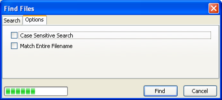
The tab elements have been placed around the main content of the window. You can see the two tabs, Search and Options. Clicking on each one will bring up the respective tab pages. As shown by the image, the two options appear on the second tab. The first tab looks pretty much like it did before, apart from the tabs along the top.
Next, we'll look at how to create grids of content.