
A palette of colors from which a user may select by clicking on one of the grid cells.
Examples
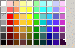
<colorpicker/>
Attributes
disabled- Type: boolean
- Indicates whether the element is disabled or not. If this attribute is set, the element is disabled. Disabled elements are usually drawn with grayed-out text. If the element is disabled, it does not respond to user actions, it cannot be focused, and the
commandevent will not fire. In the case of form elements, it will not be submitted. Do not set the attribute totrue, as this will suggest you can set it tofalseto enable the element again, which is not the case.Thedisabledattribute is allowed only for form controls. Using it with an anchor tag (an<a>link) will have no effect.The element will, however, still respond to mouse events. To enable the element, leave this attribute out entirely. - Visible controls have a
disabledproperty which, except for menus and menuitems, is normally preferred to use of the attribute, as it may need to update additional state.
color- Type: color string
- The currently selected color. This is modified when the user selects a color. You can assign a string of the form #RRGGBB to this property to change the selected color.
Overview
An onchange attribute is an event listener to the object for the Event change. A change event is fired in different ways for different XUL Input Elements as listed below:
onchange- Type: script code
| TextBox | When Enter key is pressed |
| Radio/Check Box | When the state is changed |
| Select List | When the selected item is changed |
What is accessible
The script context at this point can only access the following things:
- Global Values/Functions i.e. window, document, or any of the functions/objects/variables bound to the window object
- Event object
Example
<?xml version="1.0"?>
<?xml-stylesheet href="chrome://global/skin/" type="text/css"?>

<window
    id="findfile-window"
    title="Find Files"
    orient="horizontal"
    xmlns="http://www.mozilla.org/keymaster/gatekeeper/there.is.only.xul">
  <script type="text/javascript">
  function myFunction(e){
    /*
      Do something cool here or just say the below
    */
    alert(e.target.nodeName);
  }
  </script>
  <textbox id="find-text" onchange="return myFunction(event);"/>
</window>
preference- Type: id
- Connects the element to a corresponding
preference. This attribute only has any effect when used inside aprefwindow. More information is available in the Preferences System article.
tabindex- Type: integer
- The tab order of the element. The tab order is the order in which the focus is moved when the user presses the "
tab" key. Elements with a highertabindexare later in the tab sequence.
type- Type: string
- If this attribute is not present, the colorpicker is displayed inside the window. If this is set to the text
button, the colorpicker is displayed as a button. When the user clicks the button, a popup appears for the user to select a color.
Properties
-
accessibleType - Type: integer
- A value indicating the type of accessibility object for the element.
-
color - Type: color string
- The currently selected color. This is modified when the user selects a color. You can assign a string of the form #RRGGBB to this property to change the selected color.
open- Type: boolean
- Returns
trueif the popup for a button-typecolorpickeris open. Set this property totrueto open the popup orfalseto close the popup.
value property gets and sets color attribute
Methods
Related
- Interfaces
nsIDOMXULControlElement
Bugs
The onchange Event only fires if Attribute type is set to "button". You may use onclick when you are working with a plain colorpicker and need the currently selected color for example to display in a <textbox>.