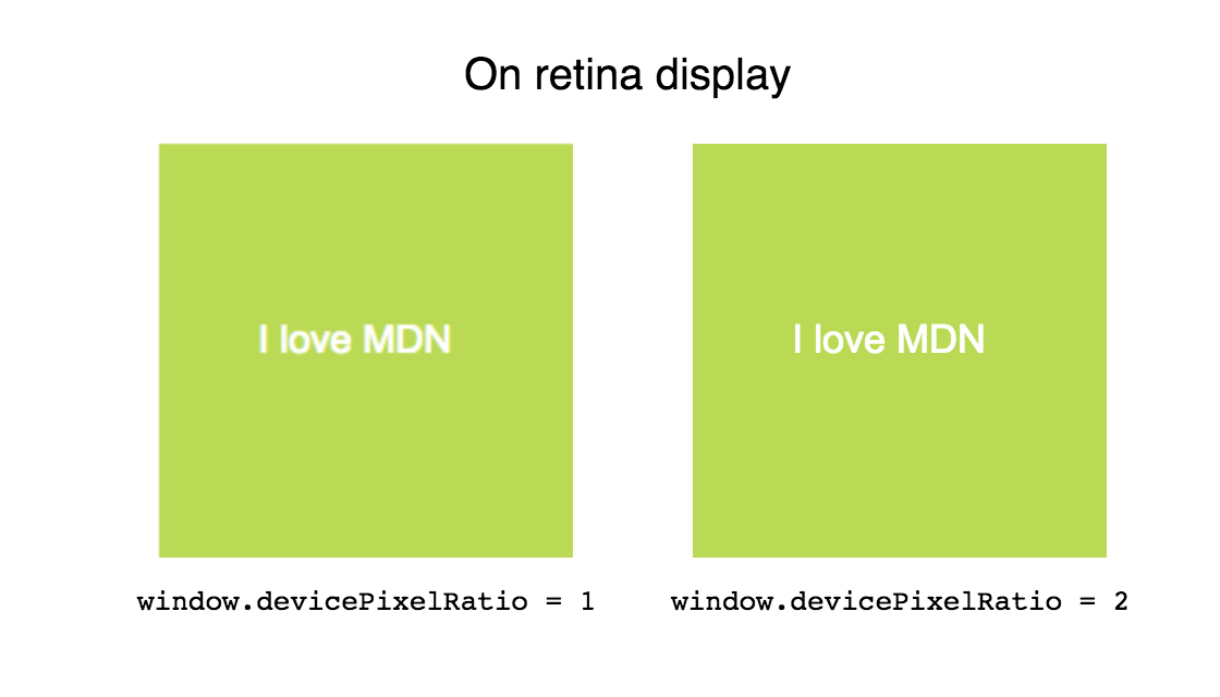
The devicePixelRatio of Window interface returns the ratio of the resolution in physical pixels to the resolution in CSS pixels for the current display device. This value could also be interpreted as the ratio of pixel sizes: the size of one CSS pixel to the size of one physical pixel. In simpler terms, this tells the browser how many of the screen's actual pixels should be used to draw a single CSS pixel.
This is useful when dealing with the difference between rendering on a standard display versus a HiDPI or Retina display, which use more screen pixels to draw the same objects, resulting in a sharper image.
You can use window.matchMedia() to check if the value of devicePixelRatio changes (which can happen, for example, if the user drags the window to a display with a different pixel density). See the example below.
Syntax
value = window.devicePixelRatio;
Value
A double-precision floating-point value indicating the ratio of the display's resolution in physical pixels to the resolution in CSS pixels. A value of 1 indicates a classic 96 DPI (76 DPI on some platforms) display, while a value of 2 is expected for HiDPI/Retina displays. Other values may be returned as well in the case of unusually low resolution displays or, more often, when a screen has a higher pixel depth than simply double the standard resolution of 96 or 76 DPI.
Examples
Correcting resolution in a <canvas>
A <canvas> can appear too blurry on retina screens. Use window.devicePixelRatio to determine how much extra pixel density should be added to allow for a sharper image.
HTML
<canvas id="canvas"></canvas>
JavaScript
var canvas = document.getElementById('canvas');
var ctx = canvas.getContext('2d');

// Set display size (css pixels).
var size = 200;
canvas.style.width = size + "px";
canvas.style.height = size + "px";

// Set actual size in memory (scaled to account for extra pixel density).
var scale = window.devicePixelRatio; // Change to 1 on retina screens to see blurry canvas.
canvas.width = Math.floor(size * scale);
canvas.height = Math.floor(size * scale);

// Normalize coordinate system to use css pixels.
ctx.scale(scale, scale);

ctx.fillStyle = "#bada55";
ctx.fillRect(10, 10, 300, 300);
ctx.fillStyle = "#ffffff";
ctx.font = '18px Arial';
ctx.textAlign = 'center';
ctx.textBaseline = 'middle';

var x = size / 2;
var y = size / 2;

var textString = "I love MDN";
ctx.fillText(textString, x, y);
Monitoring screen resolution or zoom level changes
In this example, we'll set up a media query and watch it to see when the device resolution changes, so that we can check the value of devicePixelRatio to handle any updates we need to.
JavaScript
The JavaScript code creates the media query that monitors the device resolution and checks the value of devicePixelRatio any time it changes.
let pixelRatioBox = document.querySelector(".pixel-ratio");
let mqString = `(resolution: ${window.devicePixelRatio}dppx)`;

const updatePixelRatio = () => {
  let pr = window.devicePixelRatio;
  let prString = (pr * 100).toFixed(0);
  pixelRatioBox.innerText = `${prString}% (${pr.toFixed(2)})`;
}

updatePixelRatio();

matchMedia(mqString).addListener(updatePixelRatio);
The string mqString is set up to be the media query itself. The media query, which begins as (resolution: 1dppx) (for standard displays) or (resolution: 2dppx) (for Retina/HiDPI displays), checks to see if the current display resolution matches a specific number of device dots per px.
The updatePixelRatio() function fetches the current value of devicePixelRatio, then sets the innerText of the element pixelRatioBox to a string which displays the ratio both as a percentage and as a raw decimal value with up to two decimal places.
Then the updatePixelRatio() function is called once to display the starting value, after which the media query is created using matchMedia() and addEventListener() is called to set up updatePixelRatio() as a handler for the change event.
HTML
The HTML creates the boxes containing the instructions and the pixel-ratio box that will display the current pixel ratio information.
<div class="container">
  <div class="inner-container">
    <p>This example demonstrates the effect of zooming the page in
       and out (or moving it to a screen with a different scaling
       factor) on the value of the property <code>Window.devicePixelRatio</code>.
       Try it and watch what happens!</p>
  </div>
    <div class="pixel-ratio"></div>
</div>
CSS
body {
  font: 22px arial, sans-serif;
}

.container {
  top: 2em;
  width: 22em;
  height: 14em;
  border: 2px solid #22d;
  margin: 0 auto;
  padding: 0;
  background-color: #a9f;
}

.inner-container {
  padding: 1em 2em;
  text-align: justify;
  text-justify: auto;
}

.pixel-ratio {
  position: relative;
  margin: auto;
  height: 1.2em;
  text-align: right;
  bottom: 0;
  right: 1em;
  font-weight: bold;
}
Result
Specifications
| Specification | Status | Comment |
|---|---|---|
| CSS Object Model (CSSOM) View Module The definition of 'Window.devicePixelRatio' in that specification. |
Working Draft | Initial definition |
Browser compatibility
| Desktop | Mobile | |||||||||||
|---|---|---|---|---|---|---|---|---|---|---|---|---|
devicePixelRatio | Chrome Full support 1 | Edge Full support 12 | Firefox Full support 18 | IE Full support 11 | Opera Full support 11.1 | Safari Full support 3 | WebView Android Full support 1 | Chrome Android Full support 18 | Firefox Android Full support 18 | Opera Android Full support 11.1 | Safari iOS Full support 1 | Samsung Internet Android Full support 1.0 |
Legend
- Full support
- Full support

