
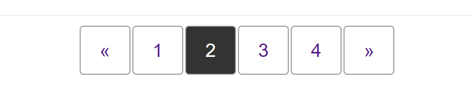
This cookbook pattern demonstrates the navigation pattern used to display pagination, where the user can move between pages of content such as search results.
Requirements
The pagination pattern typically displays items in a row. To ensure that the pagination is understandable by people using a screenreader, we mark the items up as a list inside a <nav> element, and then use CSS to display the layout visually as a row.
Typically, the pagination component will be centered horizontally underneath the content.
Recipe
Choices made
This pattern is laid out using flexbox — one flex container nested inside another. The <nav> element is designated a flex container in order that we can center the list inside using the justify-content property.
The list itself also becomes a flex container to lay the items out as a row. To space the items out we will use a margin on the flex items.
Alternative methods
Once the column-gap property has implementation in browsers this could be used instead of margins to space out the items.
.pagination {
  list-style: none;
  margin: 0;
  padding: 0;
  display: flex;
  column-gap: 2px;
}
Accessibility concerns
We want to ensure that a person using a screenreader understands what this navigation does, and where they will go when clicking a link. To help with this we have added aria-label="pagination" on the <nav> element.
We have also added some additional content that would be read by a screenreader but is hidden visually, and set the aria-hidden attribute on the paging arrows.
The "See Also" section at the end of this document has links to related accessibility topics.
Browser compatibility
The various layout methods have different browser support. See the charts below for details on basic support for the properties used.
The compatibility table in this page is generated from structured data. If you'd like to contribute to the data, please check out https://github.com/mdn/browser-compat-data and send us a pull request.
Include the compat data for key properties you used, as in the example below which includes align-items.
justify-content
| Desktop | Mobile | |||||||||||
|---|---|---|---|---|---|---|---|---|---|---|---|---|
| Supported in Flex Layout | Chrome
Full support
52
| Edge
Full support
12
| Firefox
Full support
20
| IE Full support 11 | Opera Full support 12.1 | Safari
Full support
9
| WebView Android
Full support
52
| Chrome Android
Full support
52
| Firefox Android
Full support
20
| Opera Android Full support 12.1 | Safari iOS
Full support
9
| Samsung Internet Android
Full support
6.0
|
| Supported in Grid Layout | Chrome Full support 57 | Edge Full support 16 | Firefox Full support 52 | IE No support No | Opera Full support 44 | Safari Full support 10.1 | WebView Android Full support 57 | Chrome Android Full support 52 | Firefox Android Full support 52 | Opera Android Full support 43 | Safari iOS Full support 10.3 | Samsung Internet Android Full support 6.2 |
Legend
- Full support
- Full support
- No support
- No support
- See implementation notes.
- See implementation notes.
- User must explicitly enable this feature.
- User must explicitly enable this feature.
- Requires a vendor prefix or different name for use.
- Requires a vendor prefix or different name for use.
column-gap in Flex layout
| Desktop | Mobile | |||||||||||
|---|---|---|---|---|---|---|---|---|---|---|---|---|
| Supported in Flex Layout | Chrome Full support 84 | Edge Full support 84 | Firefox Full support 63 | IE No support No | Opera Full support 70 | Safari
Full support
3
| WebView Android Full support 84 | Chrome Android Full support 84 | Firefox Android Full support 63 | Opera Android No support No | Safari iOS
Full support
2
| Samsung Internet Android No support No |
Legend
- Full support
- Full support
- No support
- No support
- Requires a vendor prefix or different name for use.
- Requires a vendor prefix or different name for use.