
The radial-gradient() CSS function creates an image consisting of a progressive transition between two or more colors that radiate from an origin. Its shape may be a circle or an ellipse. The function's result is an object of the <gradient> data type, which is a special kind of <image>.
Syntax
/* A gradient at the center of its container,
   starting red, changing to blue, and finishing green */
radial-gradient(circle at center, red 0, blue, green 100%)
Values
<position>- The position of the gradient, interpreted in the same way as
background-positionortransform-origin. If unspecified, it defaults tocenter. <shape>- The gradient's shape. The value can be
circle(meaning that the gradient's shape is a circle with constant radius) orellipse(meaning that the shape is an axis-aligned ellipse). If unspecified, it defaults toellipse. <extent-keyword>- A keyword describing how big the ending shape must be. The possible values are:
Keyword Description closest-sideThe gradient's ending shape meets the side of the box closest to its center (for circles) or meets both the vertical and horizontal sides closest to the center (for ellipses). closest-cornerThe gradient's ending shape is sized so that it exactly meets the closest corner of the box from its center. farthest-sideSimilar to closest-side, except the ending shape is sized to meet the side of the box farthest from its center (or vertical and horizontal sides).farthest-cornerThe default value, the gradient's ending shape is sized so that it exactly meets the farthest corner of the box from its center. Note: Early implementations of this function included other keywords (
coverandcontain) as synonyms of the standardfarthest-cornerandclosest-side, respectively. Use the standard keywords only, as some implementations have already dropped those older variants. <linear-color-stop>- A color-stop's
<color>value, followed by an one or two optional stop positions (either a<percentage>or a<length>along the gradient's axis). A percentage of0%, or a length of0, represents the center of the gradient; the value100%represents the intersection of the ending shape with the virtual gradient ray. Percentage values in between are linearly positioned on the gradient ray. Including two stop positions is equivalent to declaring two color stops with the same color at the two positions. <color-hint>- Th color-hint is an interpolation hint defining how the gradient progresses between adjacent color stops. The length defines at which point between two color stops the gradient color should reach the midpoint of the color transition. If omitted, the midpoint of the color transition is the midpoint between two color stops.
Description
As with any gradient, a radial gradient has no intrinsic dimensions; i.e., it has no natural or preferred size, nor a preferred ratio. Its concrete size will match the size of the element it applies to.
To create a radial gradient that repeats so as to fill its container, use the repeating-radial-gradient() function instead.
Because <gradient>s belong to the <image> data type, they can only be used where <image>s can be used. For this reason, radial-gradient() won't work on background-color and other properties that use the <color> data type.
Composition of a radial gradient
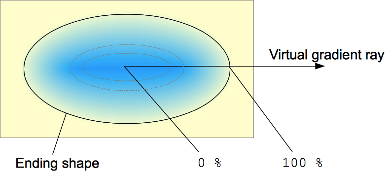 A radial gradient is defined by a center point, an ending shape, and two or more color-stop points.
To create a smooth gradient, the radial-gradient() function draws a series of concentric shapes radiating out from the center to the ending shape (and potentially beyond). The ending shape may be either a circle or an ellipse.
Color-stop points are positioned on a virtual gradient ray that extends horizontally from the center towards the right. Percentage-based color-stop positions are relative to the intersection between the ending shape and this gradient ray, which represents 100%. Each shape is a single color determined by the color on the gradient ray it intersects.
Examples
Simple gradient
<div class="radial-gradient"></div>
.radial-gradient {
  width: 240px;
  height: 120px;
}
.radial-gradient {
  background-image: radial-gradient(cyan 0%, transparent 20%, salmon 40%);
}
Non-centered gradient
<div class="radial-gradient"></div>
.radial-gradient {
  width: 240px;
  height: 120px;
}
.radial-gradient {
  background-image: radial-gradient(farthest-corner at 40px 40px,
      #f35 0%, #43e 100%);
}
More radial-gradient examples
Please see Using CSS gradients for more examples.
Specifications
| Specification | Status | Comment |
|---|---|---|
| CSS Images Module Level 3 The definition of 'radial-gradients()' in that specification. |
Candidate Recommendation | Initial definition. |
Browser compatibility
| Desktop | Mobile | |||||||||||
|---|---|---|---|---|---|---|---|---|---|---|---|---|
radial-gradient() | Chrome
Full support
26
| Edge Full support 12 | Firefox
Full support
16
| IE
Full support
10
| Opera
Full support
12.1
| Safari
Full support
6.1
| WebView Android
Full support
≤37
| Chrome Android
Full support
26
| Firefox Android
Full support
16
| Opera Android
Full support
12.1
| Safari iOS
Full support
6.1
| Samsung Internet Android
Full support
1.5
|
at syntax | Chrome Full support 26 | Edge Full support 12 | Firefox
Full support
16
| IE Full support 10 | Opera
Full support
15
| Safari No support No | WebView Android Full support ≤37 | Chrome Android Full support 26 | Firefox Android
Full support
16
| Opera Android
Full support
14
| Safari iOS No support No | Samsung Internet Android Full support 1.5 |
| Double-position color stops | Chrome Full support 71 | Edge Full support 79 | Firefox Full support 64 | IE No support No | Opera Full support 58 | Safari Full support 12.1 | WebView Android Full support 71 | Chrome Android Full support 71 | Firefox Android Full support 64 | Opera Android Full support 50 | Safari iOS Full support 12.2 | Samsung Internet Android Full support 10.0 |
| Interpolation Hints / Gradient Midpoints | Chrome Full support 40 | Edge Full support 79 | Firefox Full support 36 | IE No support No | Opera Full support 27 | Safari Full support 6.1 | WebView Android Full support 40 | Chrome Android Full support 40 | Firefox Android Full support 36 | Opera Android Full support 27 | Safari iOS Full support 6.1 | Samsung Internet Android Full support 4.0 |
Legend
- Full support
- Full support
- No support
- No support
- See implementation notes.
- See implementation notes.
- User must explicitly enable this feature.
- User must explicitly enable this feature.
- Requires a vendor prefix or different name for use.
- Requires a vendor prefix or different name for use.
Quantum CSS notes
Gecko used to have a long-standing bug whereby radial gradients like radial-gradient(circle gold,red) would work, even though they shouldn't because of the missing comma between circle and gold. Also, calc() expressions were rejected — causing the value to be invalid — when used as the radius component of a radial-gradient() function (bug 1376019). Firefox's new parallel CSS engine (also known as Quantum CSS or Stylo, released in Firefox 57) fixed these bugs.