Experimental
Provides access to button, toolbar, and sidebar UI objects. This module exports constructors for the following:
Each object has its own reference page, linked above: for all the details please refer to the reference page. This page just provides a quick overview.
ActionButton
An action button is a button in the main Firefox toolbar. You give it an icon, a label, and a click handler:
var ui = require("sdk/ui");
var action_button = ui.ActionButton({
id: "my-button",
label: "Action Button!",
icon: "./icon.png",
onClick: function(state) {
console.log("You clicked '" + state.label + "'");
}
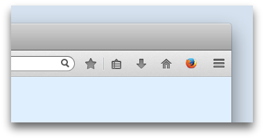
});You can make a button standalone or add it to a toolbar. If it's standalone, it appears in the toolbar at the top right of the browser window:
ToggleButton
A toggle button is a special kind of button that's for representing a binary on/off state, like a checkbox. So they have a checked property which is toggled when the user clicks the button, and the icon gets a "pressed" look when the button is checked. It's otherwise identical to the action button.
Attaching panels to buttons is only supported from Firefox 30 onwards.
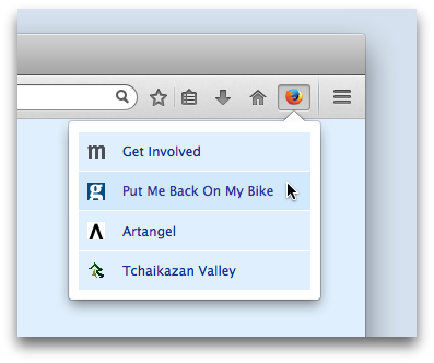
From Firefox 30 onwards, you can attach panels to toggle buttons, by passing the button into the panel's constructor or its show() method:
Frame
A frame enables you to create an HTML iframe, using bundled HTML, CSS and JavaScript. This can then be added to a designated area of the Firefox user interface. At the moment you can only add frames to a toolbar.
You initialize a frame with a URL pointing to an HTML document supplied under your add-on's "data" directory. This document can refer to bundled CSS and JavaScript files, and your main add-on can communicate with a frame script using message passing. Once you've created a frame you need to add it to a toolbar.
Toolbar
The ability to add buttons to toolbars is new in Firefox 30. In Firefox 29 you can only add frames to toolbars.
A toolbar gives you a horizontal strip of space which you can use for presenting a more complex user interface. You initialize a toolbar with an array of buttons and frames:
var ui = require("sdk/ui");

var { ActionButton } = require("sdk/ui/button/action");
var { Toolbar } = require("sdk/ui/toolbar");
var { Frame } = require("sdk/ui/frame");

var previous = ui.ActionButton({
  id: "previous",
  label: "previous",
  icon: "./icons/previous.png"
});

var next = ui.ActionButton({
  id: "next",
  label: "next",
  icon: "./icons/next.png"
});

var play = ui.ActionButton({
  id: "play",
  label: "play",
  icon: "./icons/play.png"
});

var frame = ui.Frame({
  url: "./frame-player.html"
});

var toolbar = ui.Toolbar({
  title: "Player",
  items: [previous, next, play, frame]
});
The toolbar appears just above the content window:
Sidebar
A sidebar gives you a vertical strip of space for presenting complex user interfaces. You initialize a sidebar with a URL pointing to an HTML document supplied under your add-on's "data" directory. This document can refer to bundled CSS and JavaScript files, and your main add-on can communicate with a frame script using message passing.
var ui = require("sdk/ui");

var sidebar = ui.Sidebar({
  id: 'my-sidebar',
  title: 'My sidebar',
  url: require("sdk/self").data.url("sidebar.html")
});
It appears on the left of the content window: